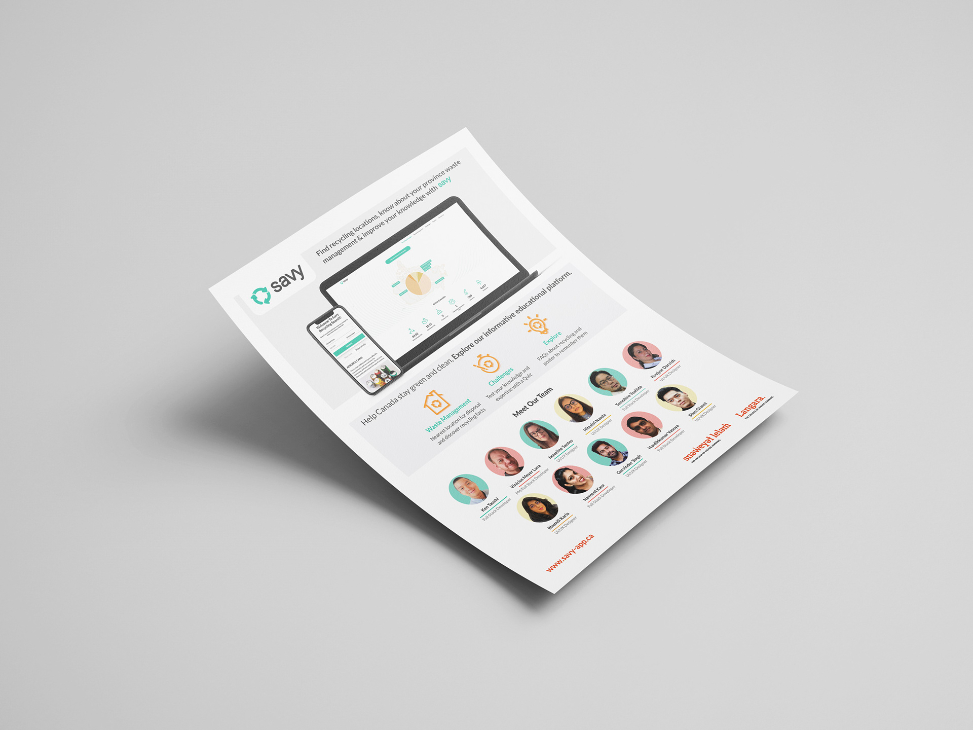
about this project
Savy is a data driven, responsive web platform that provides a variety of information about recycling. Many people are aware of environmental issues, however, they do not know how to start to protect the environment in the first place, or even the practical benefits of recycling. This website empowers environmental groups and governments, as well as supports citizens who are eager to learn more about recycling and how to improve on it.
Savy focuses on showing statistical recycling data about Canada and its provinces, data on recycling products, industries and employees that relies on recycling per province. The data visualization was done by breaking down and simplifying complex information in the form of graphs, charts and icons, which made it easy for anyone to understand.
This platform provides reliable information for citizens who are new to Canada and not very familiar about the recycling process and also provide proper ways of recycling each material.
My Role
I worked as a UI/UX designer in this project, and was responsible for the home page and its responsiveness. I also participated in the building of the user flow, high fidelity wireframes and mockups in web browser and mobile versions using Adobe XD and Illustrator. Also I designed project proposals using Adobe InDesign. As a UI/UX designer, I also participated in creating blueprint and user persona.
User Flow
For the flow we had meetings with our designers and developers to see the best fit for users to traverse through the website and what makes more sense if we were users. We had different sections that revealed important information.
Also, we needed a way to keep users engaged with this platform, so after researching, we came to the conclusion to add a challenge there. This way, users were not only engaged but they learned something new along the way.
Blueprint strategy
My team and I answered questions for issues that people are facing and how we can minimize those problems and how it should be improved and the measures we should take for the best outcome.
Wireframe for home page (desktop View)
I wanted to catch users' attention so I need a way to make it fun and engaging. Here on the home page I added a map of Canada with a pie chart that shows how each province is handling their recycling habits and how well they are doing that. By clicking on each province you can see details for that province.
If you do not select any province you will see overall statistics for Canada.
Then there is a block to introduce this website and then there are the features of the website.
There is also a section where testimonials of users will be displayed as a slider and at the bottom part there is a team section where I put the members of the team. This team had eleven people working together so the best way to show them was with a slider and a focus person. I decided to show everyone but the unfocused person in grayscale and just the focused person is displayed in color mode, this way everyone will get attention.
Wireframe for home page (mobile view)
We rarely miss our smartphones and we use them for everything. So I had "Savy" as a responsive website.
Mockups Vs. Actual website
High Fidelity Mockups
Actual Website (www.savy-app.ca)
Web Responsive
Everyone uses their phones for every single thing they want to do so when I was creating wireframes for this page I thought about responsiveness and how it will show in mobile view.
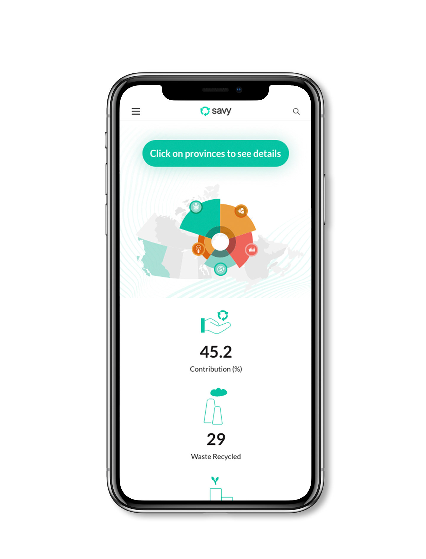
High fidelity mockups (Canada map and statistics)
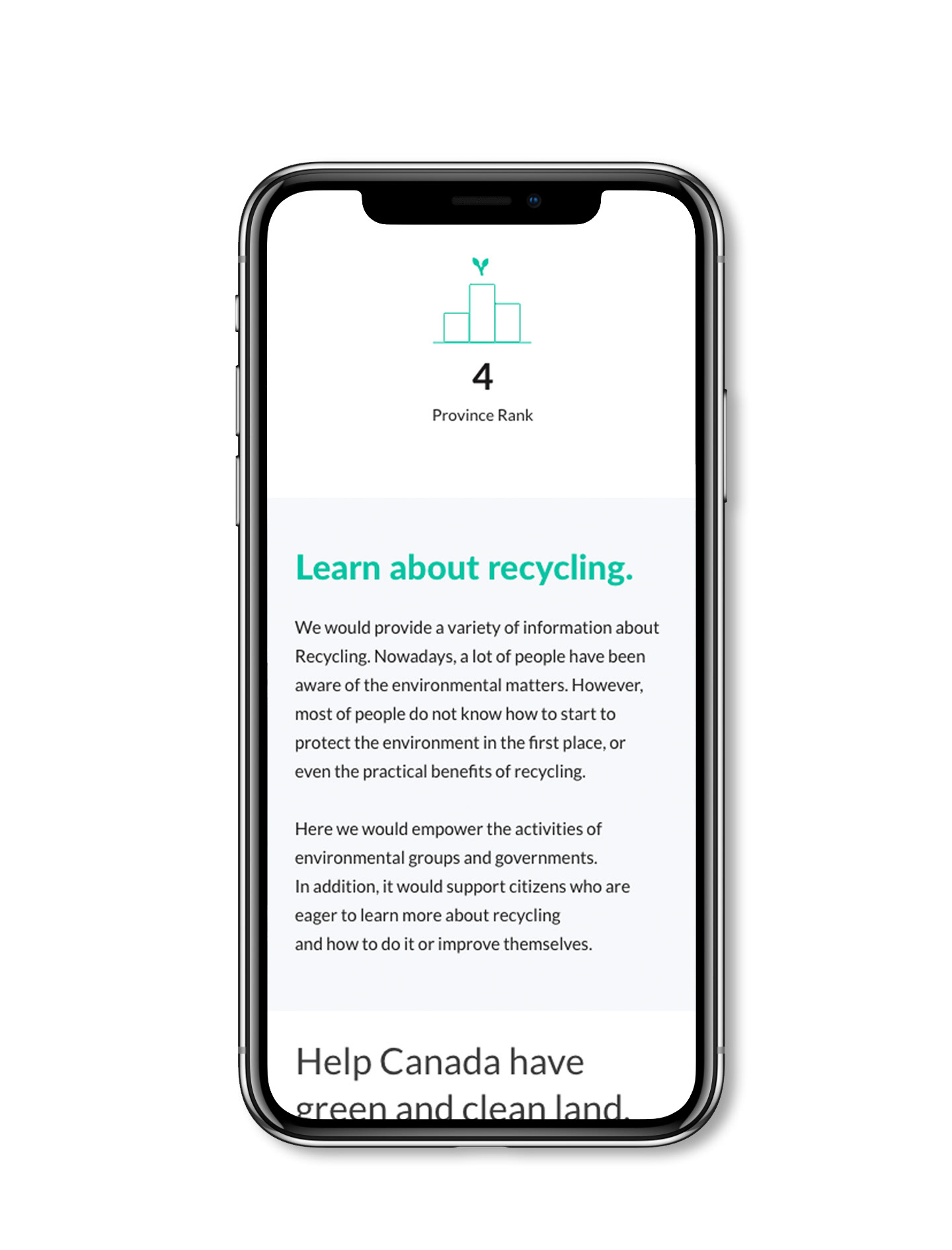
High fidelity mockups "Savy mission"
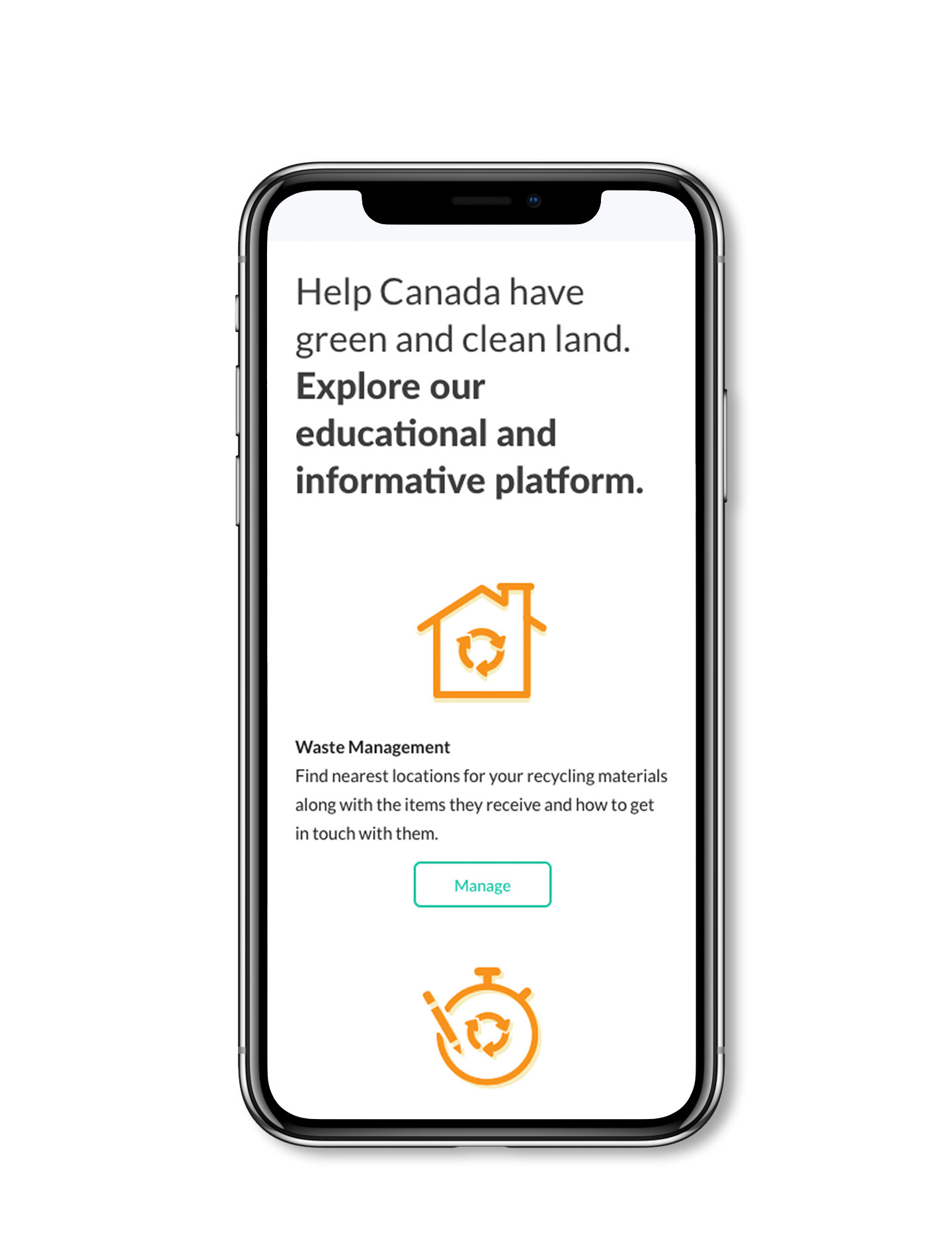
High fidelity mockups (features)
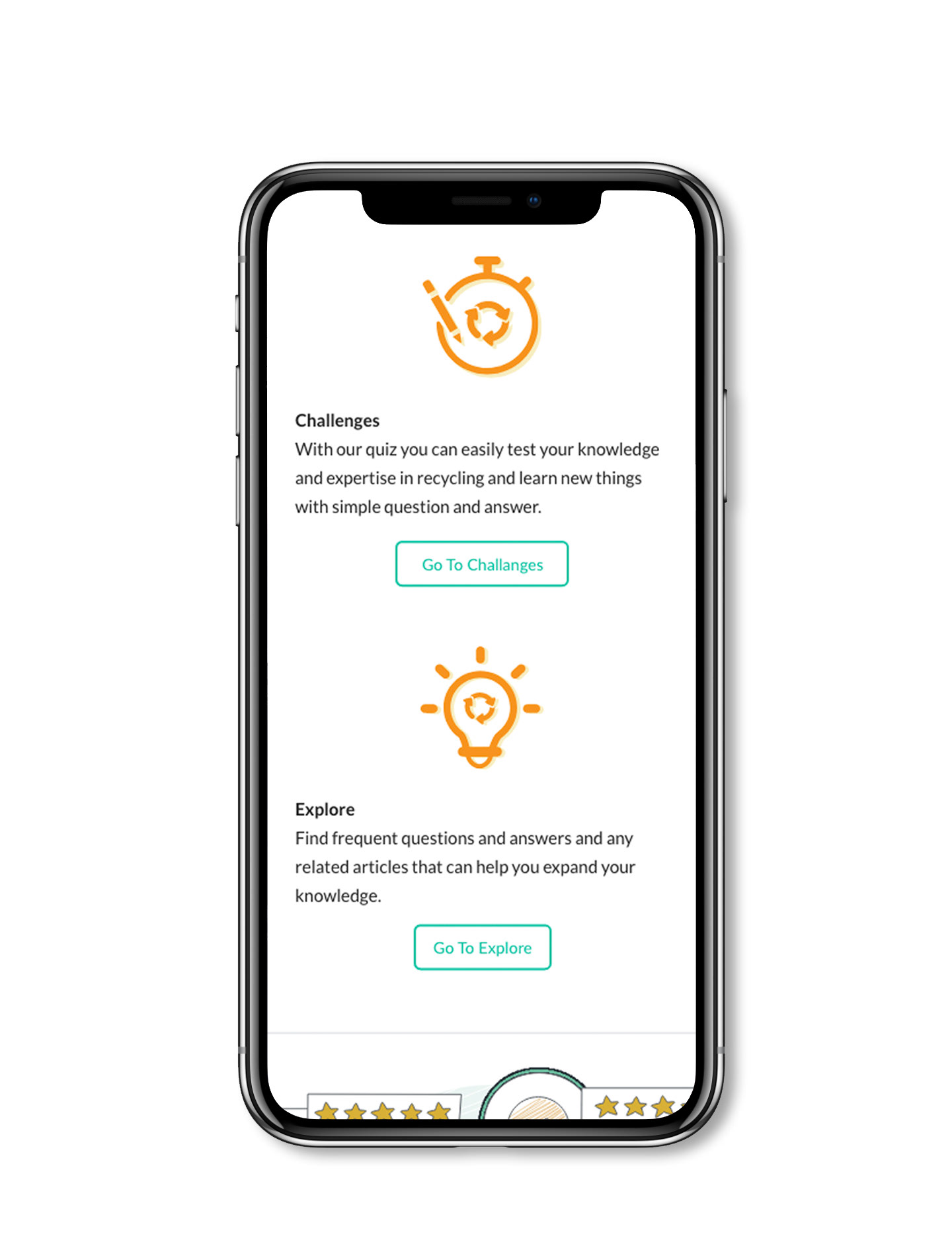
High fidelity mockups (Features Cont.)
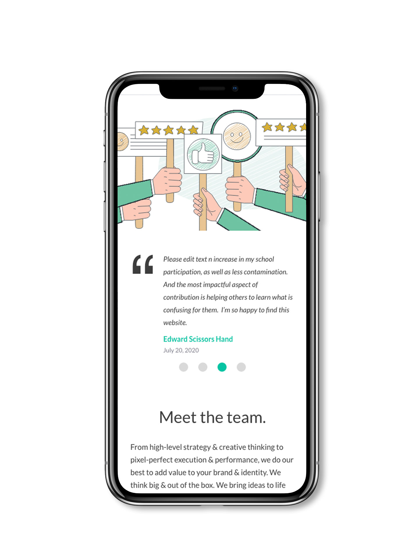
High fidelity mockups (testimonials)
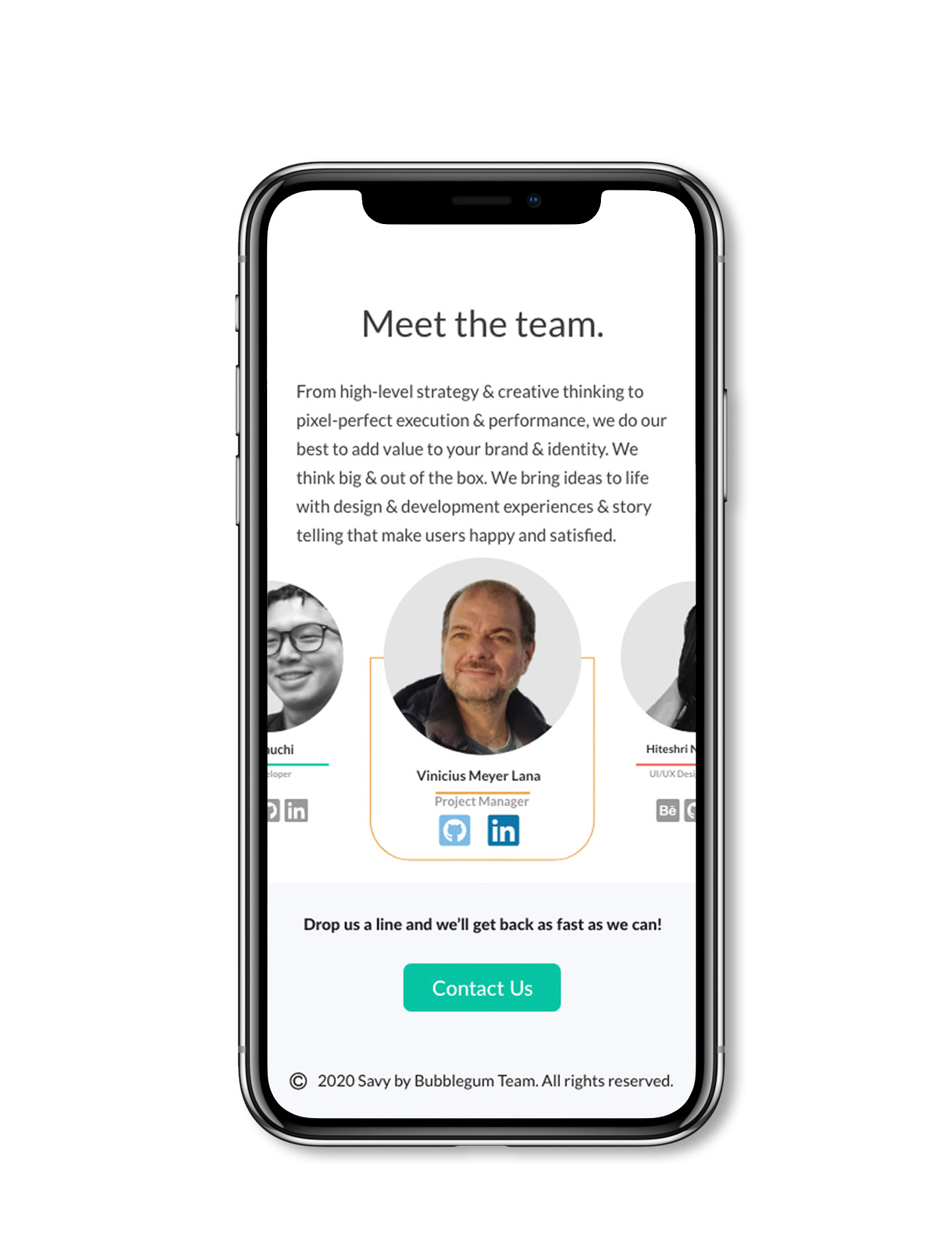
High fidelity mockups (Team section)
Project Proposal
Creating content and bringing it to life was one of my responsibilities in this project. I used Adobe InDesign to create the best outcome possible. I also used Adobe Photoshop for editing images and Adobe illustrator for creating illustrations used in this project.
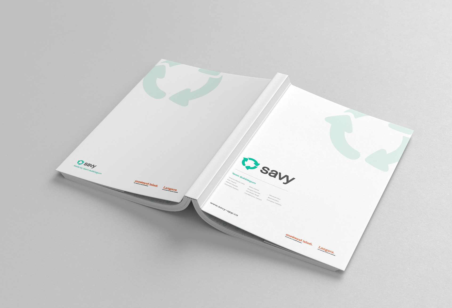
Savy Proposal Cover
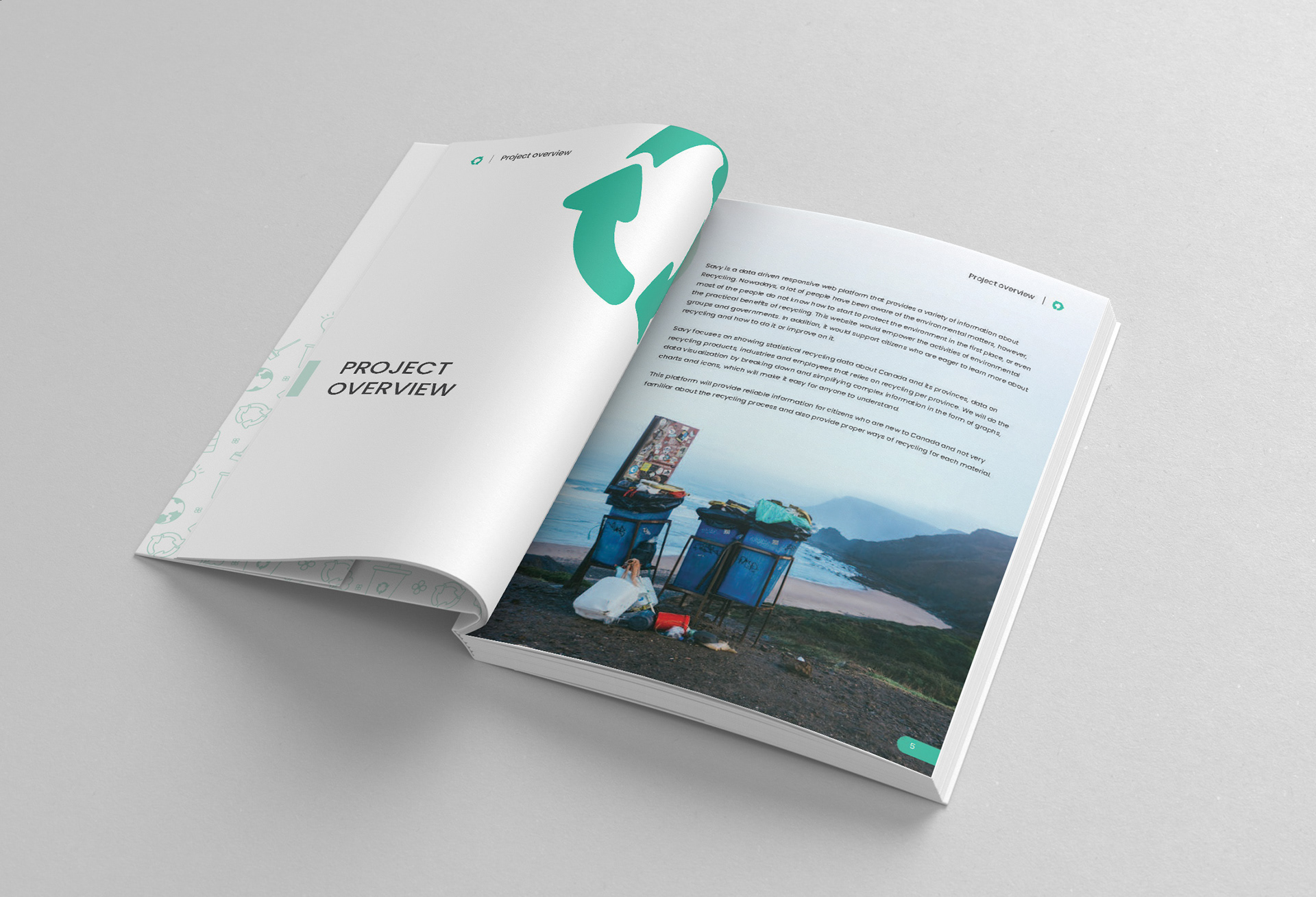
Savy Proposal Section Divider
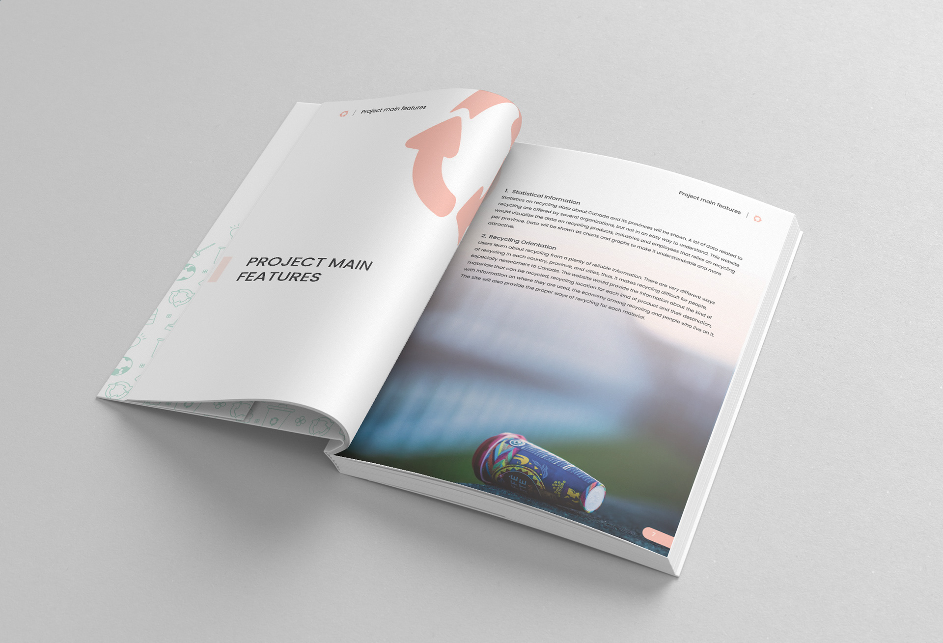
Savy Proposal Section Divider 2
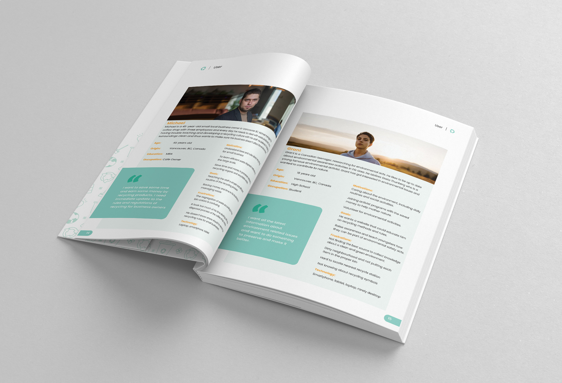
Savy Proposal User Persona
Marketing Assets
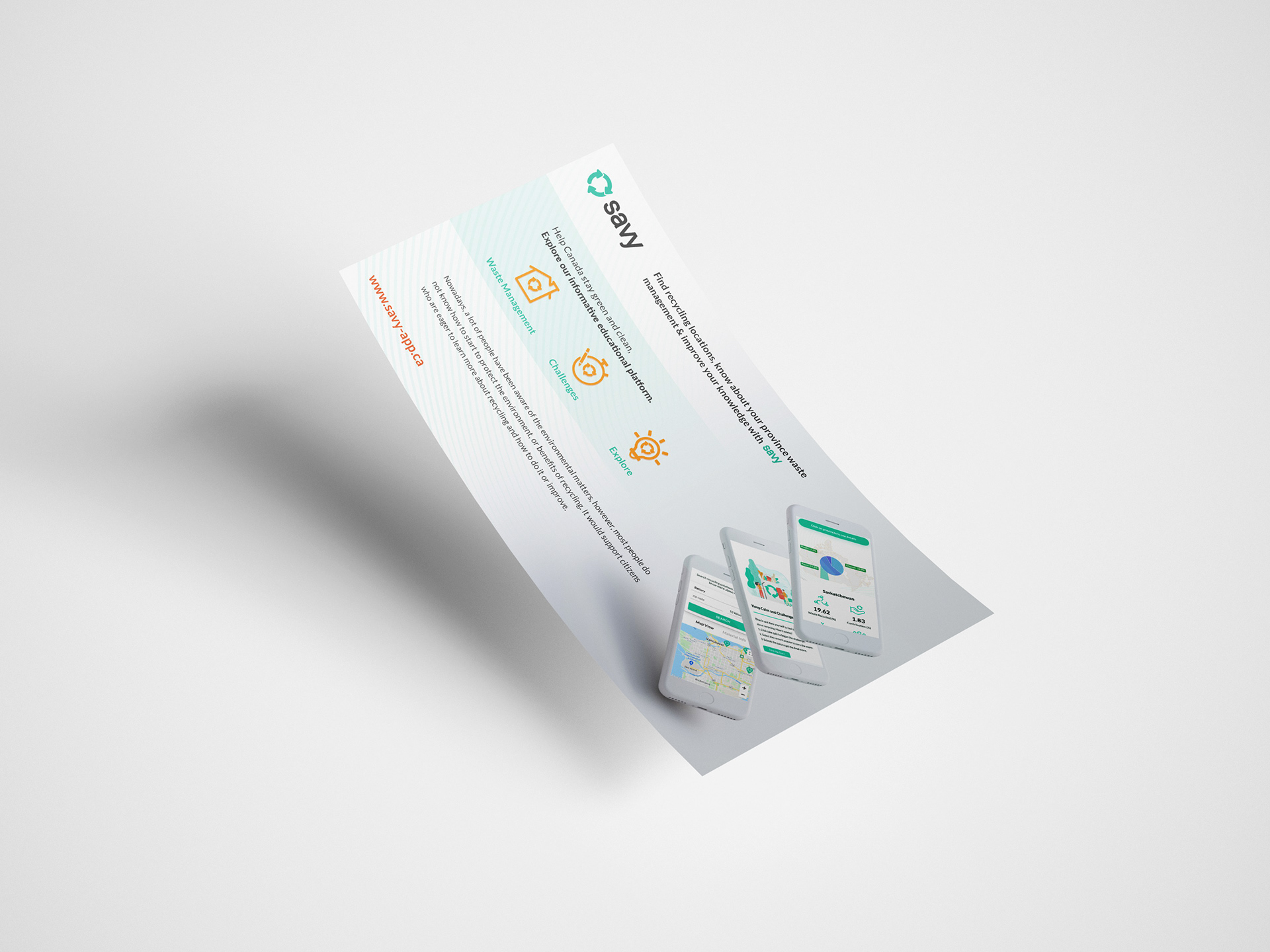
Social Media Size for Marketing Asset
