Production website: https://newlife-midwife.com/
Overview
For the New Life Midwife website, I handled the full redesign process using WordPress and a theme from ThemeForest. My responsibilities included creating a subdomain for development, collaborating with the client for approval, and launching the site upon completion. I designed a custom logo in Illustrator, selected colors and fonts that reflected the brand’s caring and professional nature, and implemented minor CSS updates to personalize the theme. Additionally, I updated and optimized the site’s content, while editing images using Photoshop to ensure a polished, cohesive look that resonated with the client’s audience.
My Role:
WordPress Website Designer, responsible for full-site customization, logo creation, and content updates.
Tools Used:
WordPress, ThemeForest theme, Illustrator, Photoshop, CSS
Problem
The New Life Midwife’s previous website lacked modern design elements and did not effectively communicate the brand’s mission. The client needed a fresh look that would resonate with their target audience, as well as better functionality for content management and navigation.
Solution
Using a theme from ThemeForest, I customized the website to reflect the client’s values of care and professionalism. I created a subdomain for development and made the site live after client approval. I also designed a custom logo in Illustrator, selected a soothing color palette and fonts to align with the brand identity, and made minor CSS updates to further personalize the theme. I updated their previous content, optimized it for clarity, and edited images to enhance the visual appeal of the site.
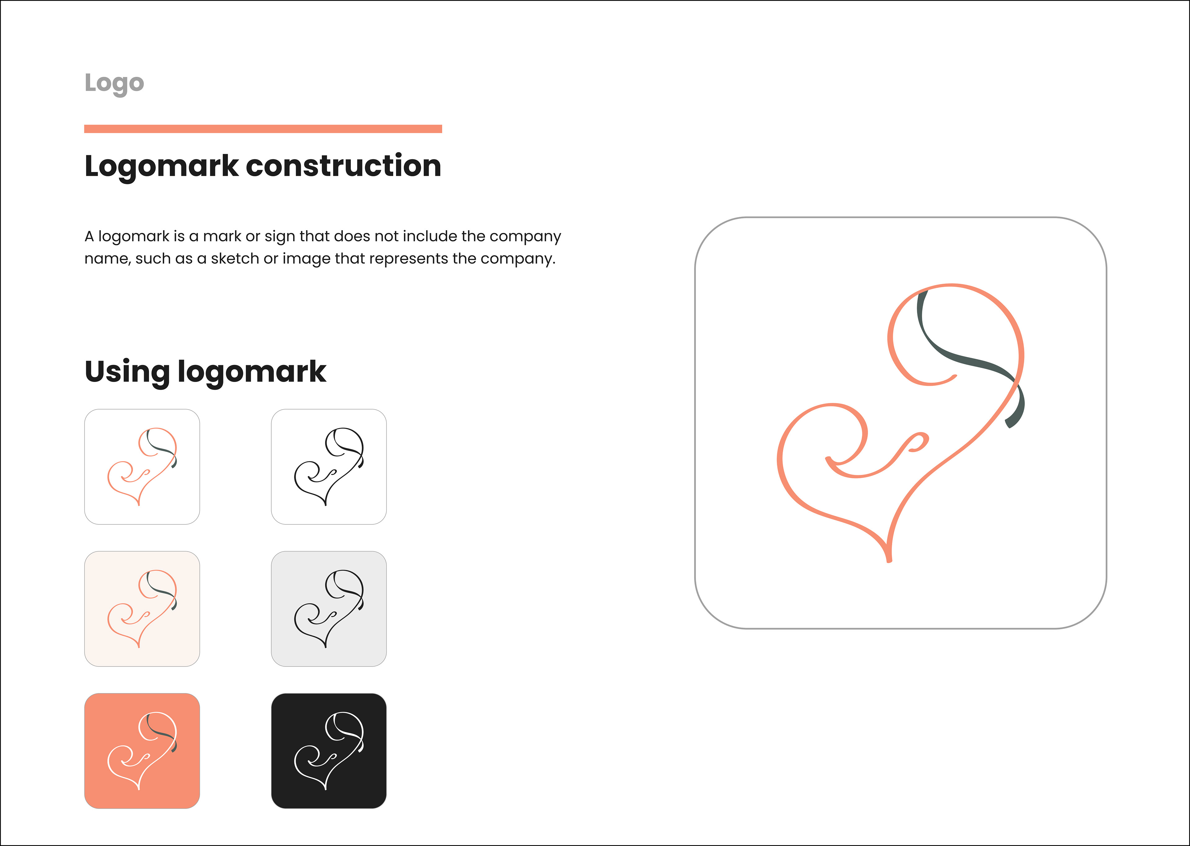
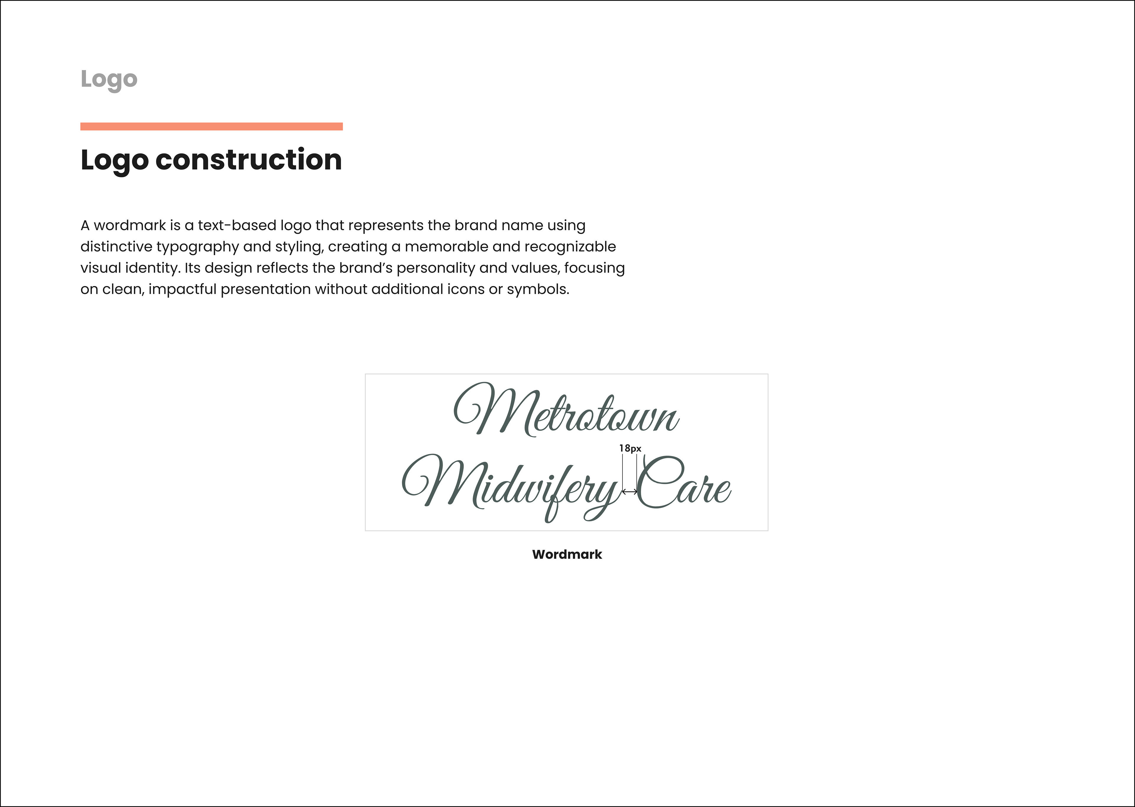
Logo Design
The logo design process was centered around capturing the essence of New Life Midwife’s mission: providing compassionate and professional care for mothers and families. I started by researching the brand’s values and target audience, looking for design inspiration that evoked trust, warmth, and support. After brainstorming several concepts, I moved into Illustrator to sketch out logo ideas. The final design featured a delicate, organic form that symbolizes life and growth, paired with soft, calming colors that reflect the nurturing aspect of the brand. The typography was chosen to be clear and approachable, giving the logo a sense of reliability and friendliness.
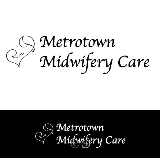
Logo Concept - Font 1
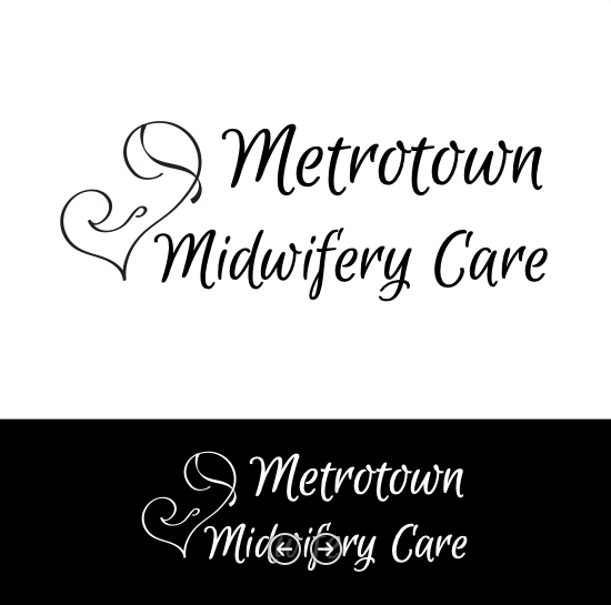
Logo Concept - Font 2
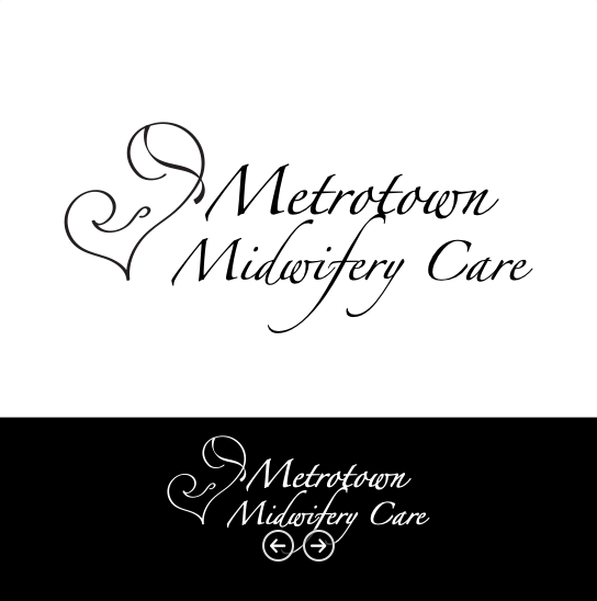
Logo Concept - Font 3

Logo Concept - Font 4

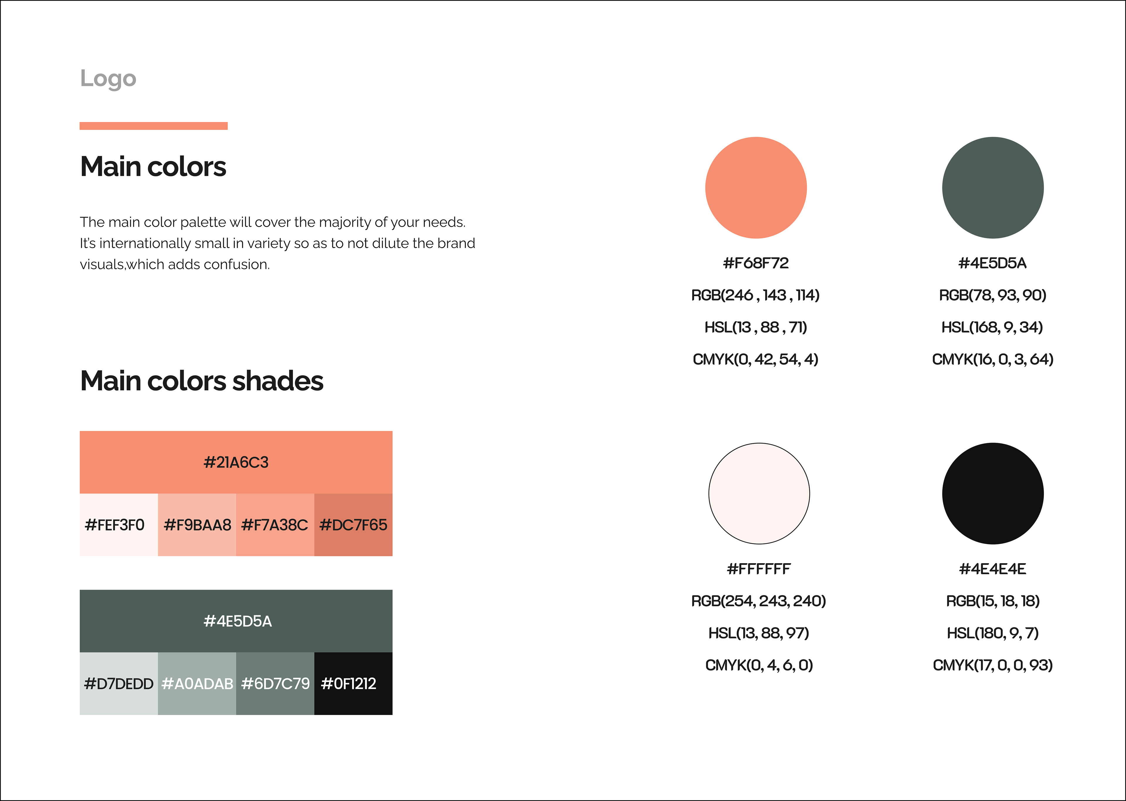
Final Logo and colors
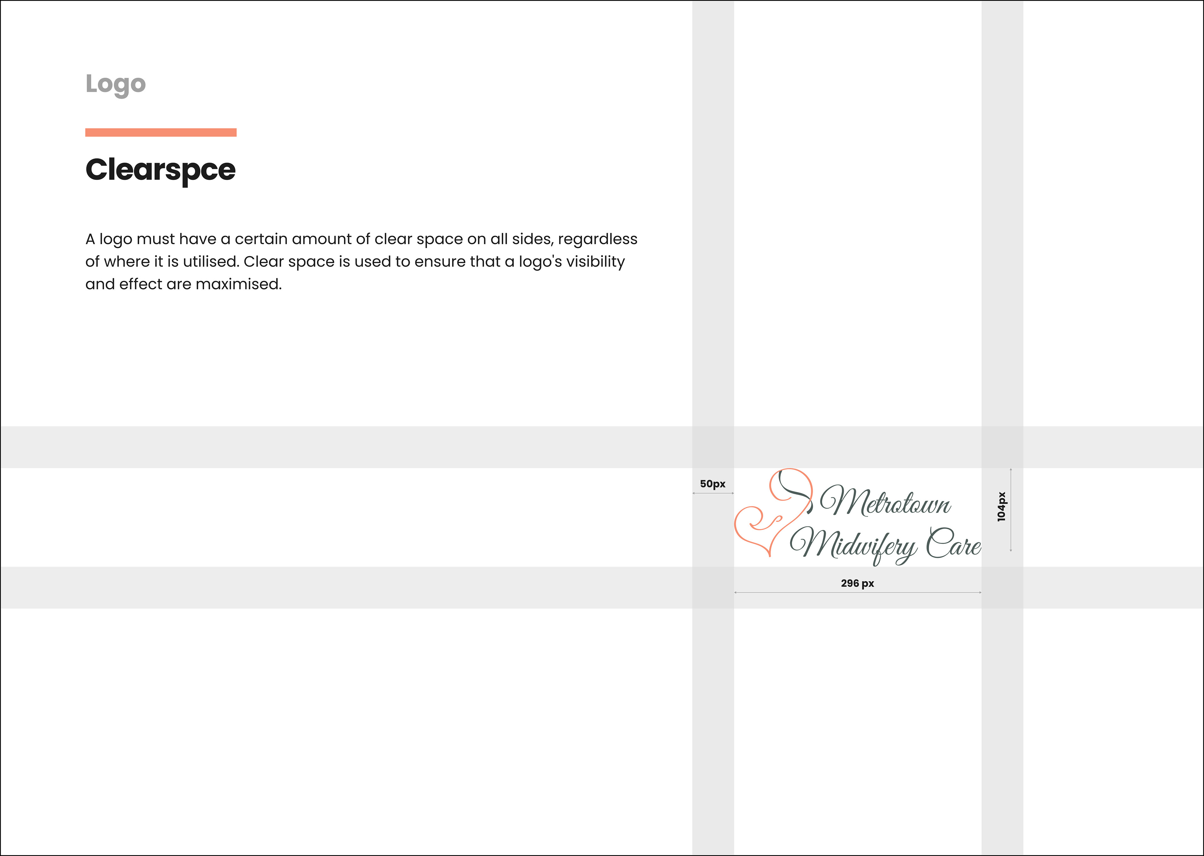
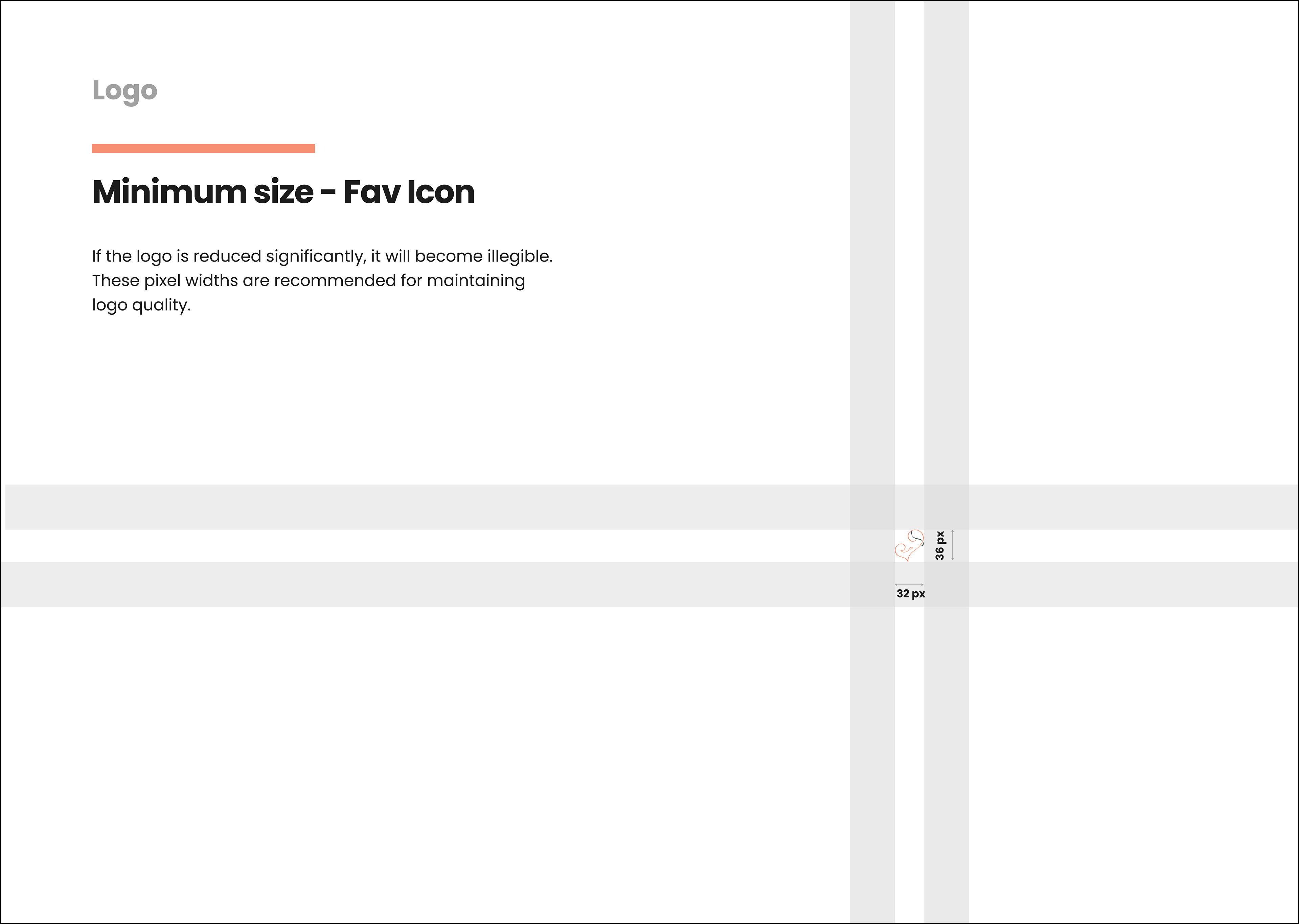
Brand Guideline
I developed a comprehensive brand guideline for Metrotown Midwifery to establish consistency across their visual identity and communications. This guideline includes logo specifications, color palette, typography, and usage standards to maintain brand cohesion in all digital and print materials. The goal was to create a clear and professional brand representation that reflects the care and reliability that Metrotown Midwifery offers to its clients.


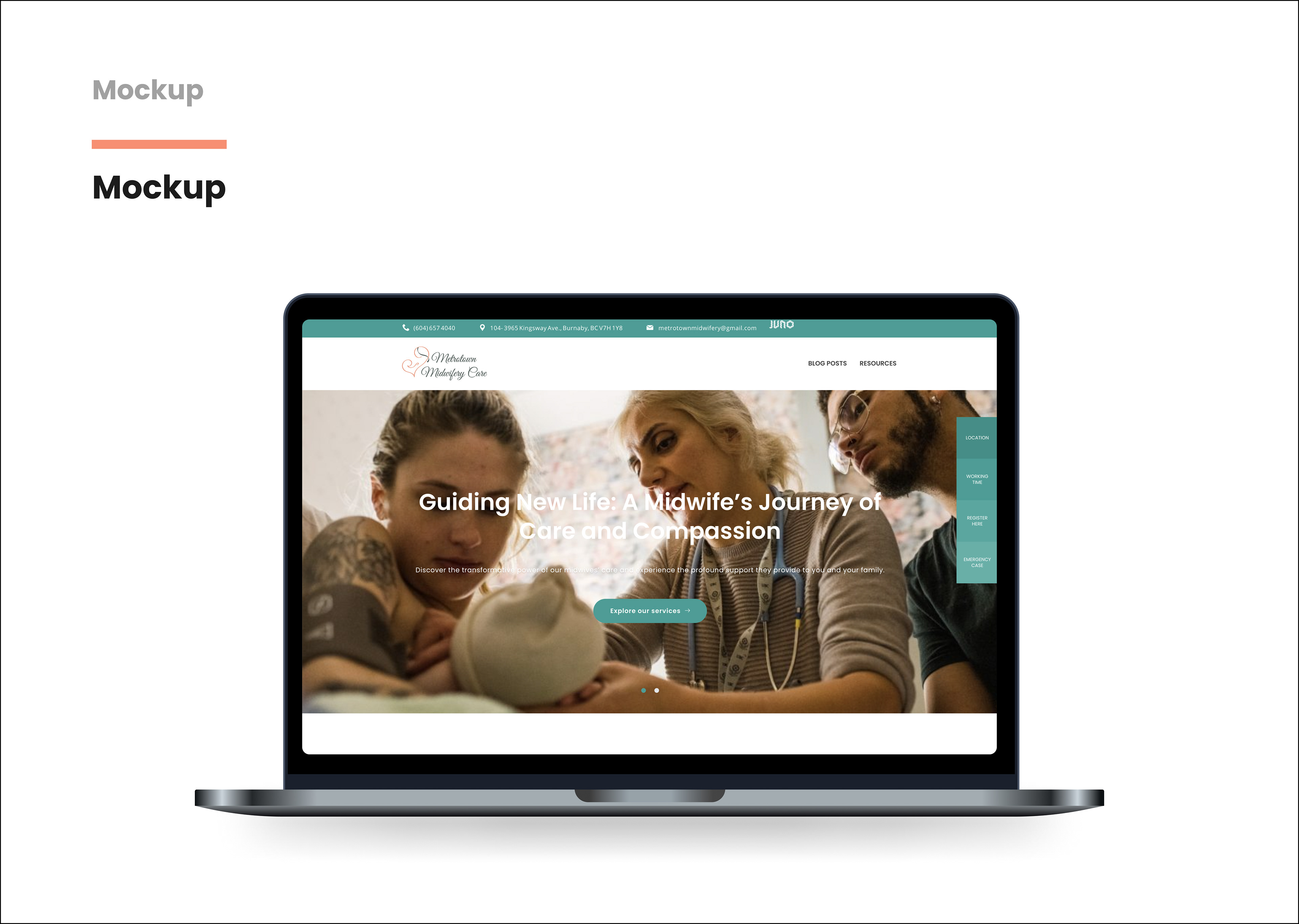

Design
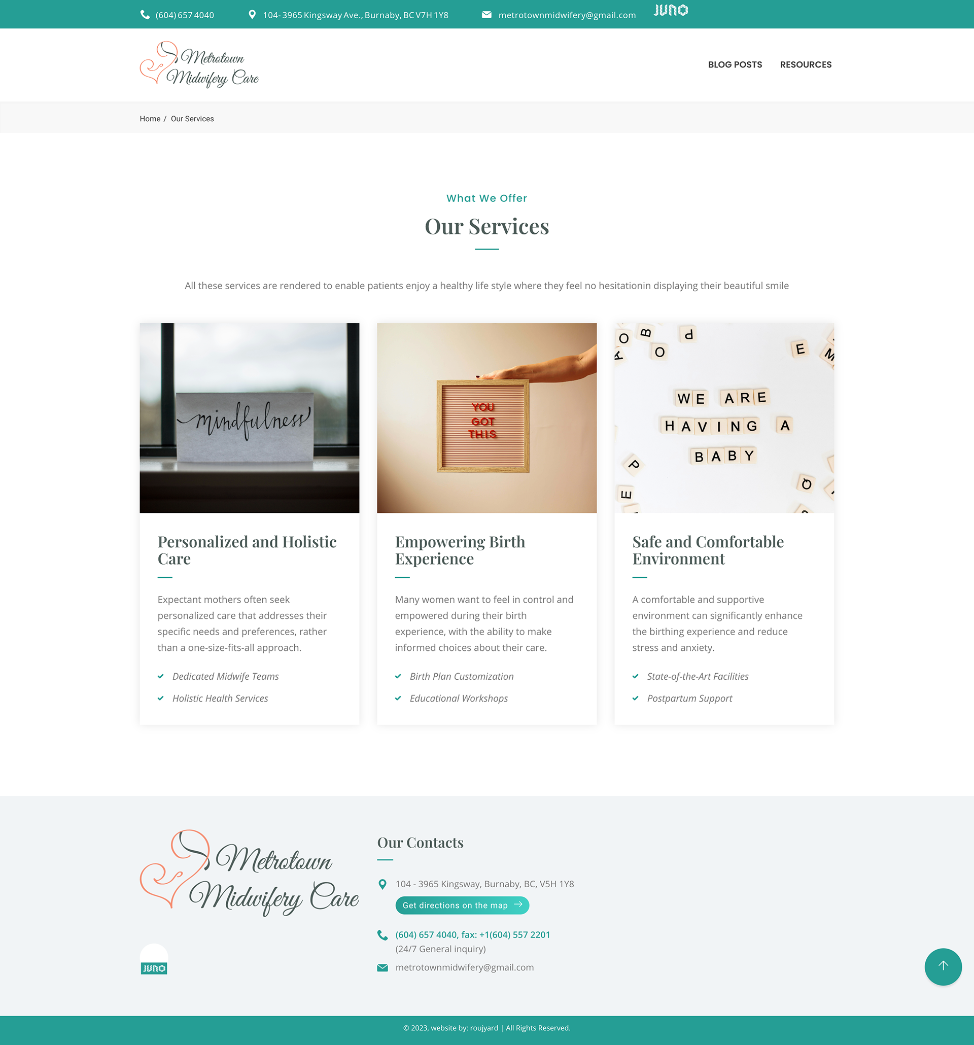
The design focused on a warm and approachable feel, using soft tones and clear typography to ensure the site was inviting and easy to navigate. I made sure the layout was simple yet effective, emphasizing important information such as services, client testimonials, and contact details. The responsive design ensures the site works well on mobile devices, enhancing accessibility for all users.