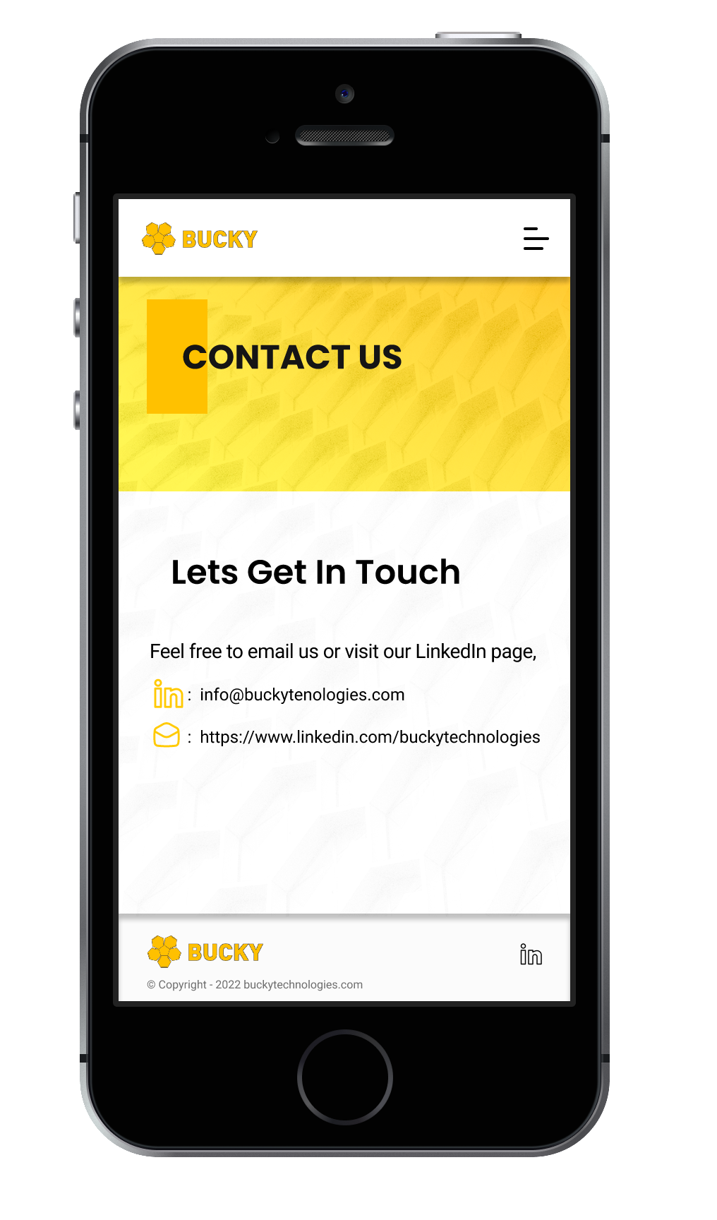
The site is currently under development and you can find it at: www.buckytechnologies.com
Overview
As the UX/UI Designer for Bucky Technologies, I took charge of redesigning their digital platform to reflect the company’s innovative and tech-forward identity. My primary goal was to improve the user experience by simplifying navigation and highlighting the company’s key offerings. Working closely with the development and marketing teams, I ensured that the new design aligned with the brand’s vision while also focusing on functionality and scalability. Using tools like Figma, Adobe Photoshop, and Adobe Illustrator, I developed a streamlined and responsive design that made the platform more accessible and engaging for users across all devices.
My Role:
Lead UX/UI Designer, responsible for creating an intuitive platform that streamlined user experience and functionality.
Tools:
Figma, Adobe Photoshop, Adobe Illustrator
Problem
Bucky Technologies needed a seamless and visually engaging interface that would support their tech-driven approach while ensuring users could easily navigate their services. Their previous platform was cluttered and lacked the modern touch that aligned with their innovative products and solutions, making it difficult for users to quickly understand the value they offered.
Solution
I developed a clean and engaging design that conveyed Bucky Technologies’ cutting-edge solutions. The new design prioritized clarity and simplicity, utilizing a modular approach to display their range of services and products. I incorporated a responsive design for all devices, implemented an optimized navigation system, and focused on reducing friction in the user journey. This ensured that the company’s technological solutions were presented clearly and efficiently.
Design
The design was inspired by the tech-driven nature of Bucky Technologies, using bold typography, a sleek color palette, and
well-defined visual hierarchy. I created a design system with reusable components to ensure consistency across the site. The layout was streamlined to focus on user needs, with dedicated sections for product details, customer success stories, and easy-to-locate CTAs for quick engagement. Testing and iterations were conducted to ensure both form and function delivered an optimal experience.
well-defined visual hierarchy. I created a design system with reusable components to ensure consistency across the site. The layout was streamlined to focus on user needs, with dedicated sections for product details, customer success stories, and easy-to-locate CTAs for quick engagement. Testing and iterations were conducted to ensure both form and function delivered an optimal experience.
Wireframes
We have worked on this using Figma for creating low-fidelity wireframes. I resolved UX obstacles through testing and iteration, prioritizing the development methods. I have conducted live user testing of components and functionality to evaluate the effectiveness of designs and enhancements.
After revisions and a session with stakeholders, it was decided to have minor changes to the mockup to have the best practice and present all the necessary information.
For the first version of the home page we had an overview of all the sections on the site but after testing it was obvious that it was best to have a simple and not a crowded design and based on the second version of the home page all other pages were built.
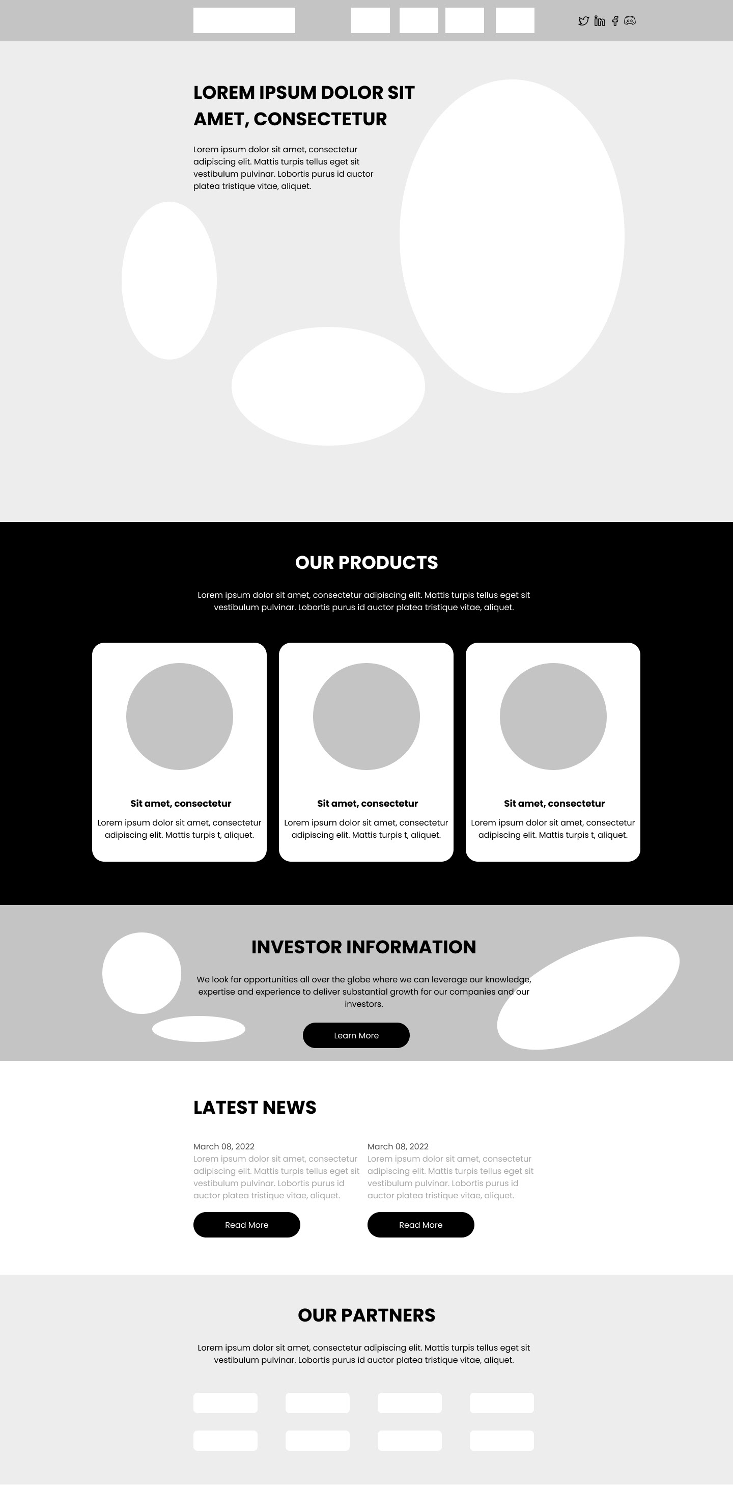
Home Page- first version

Home Page- Final version
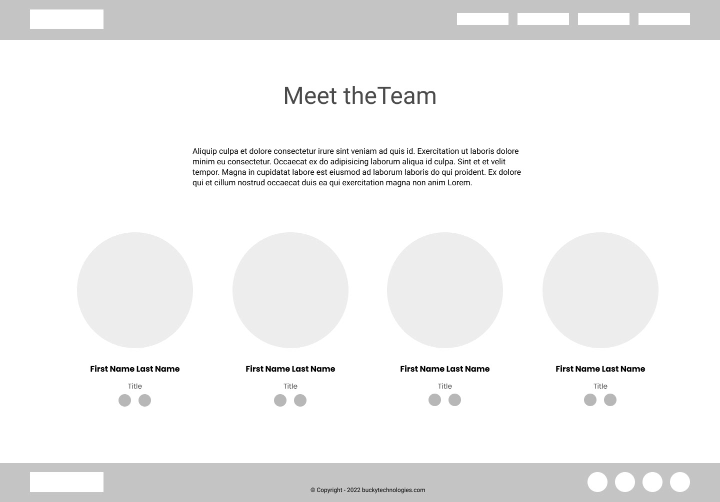
About Bucky
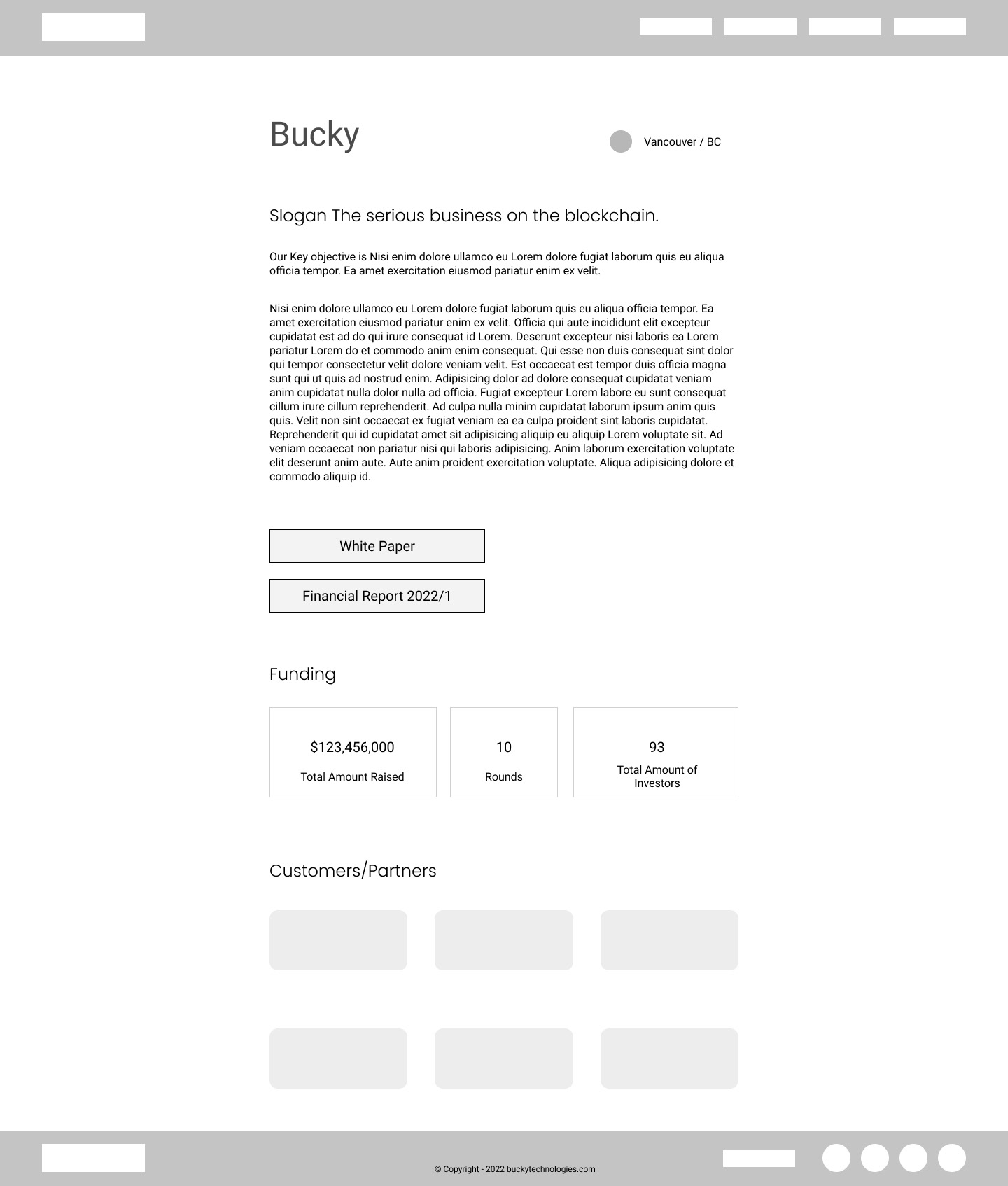
Investor Page
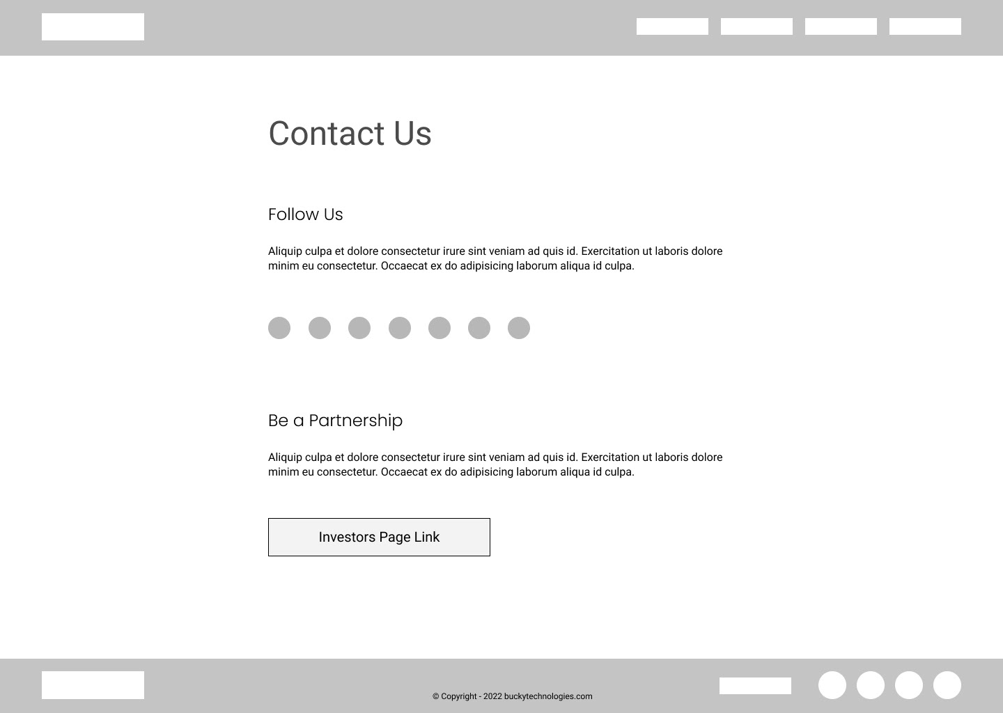
Contact Page
ICONOGRAPHY
Our Vision
About Us

Partner
Cost Efficient

Investment
Mockups
Figma was used to create high-fidelity mockups. Initially, the desktop version was created, then drafts were revised, and then mockups were created for the mobile view.
The final step was creating prototypes for the final version and having all the assets ready for the development team to begin. In an effort to ensure best practices, I tested and debugged the design logic.
Desktop Version Prototype View
Home page mockup
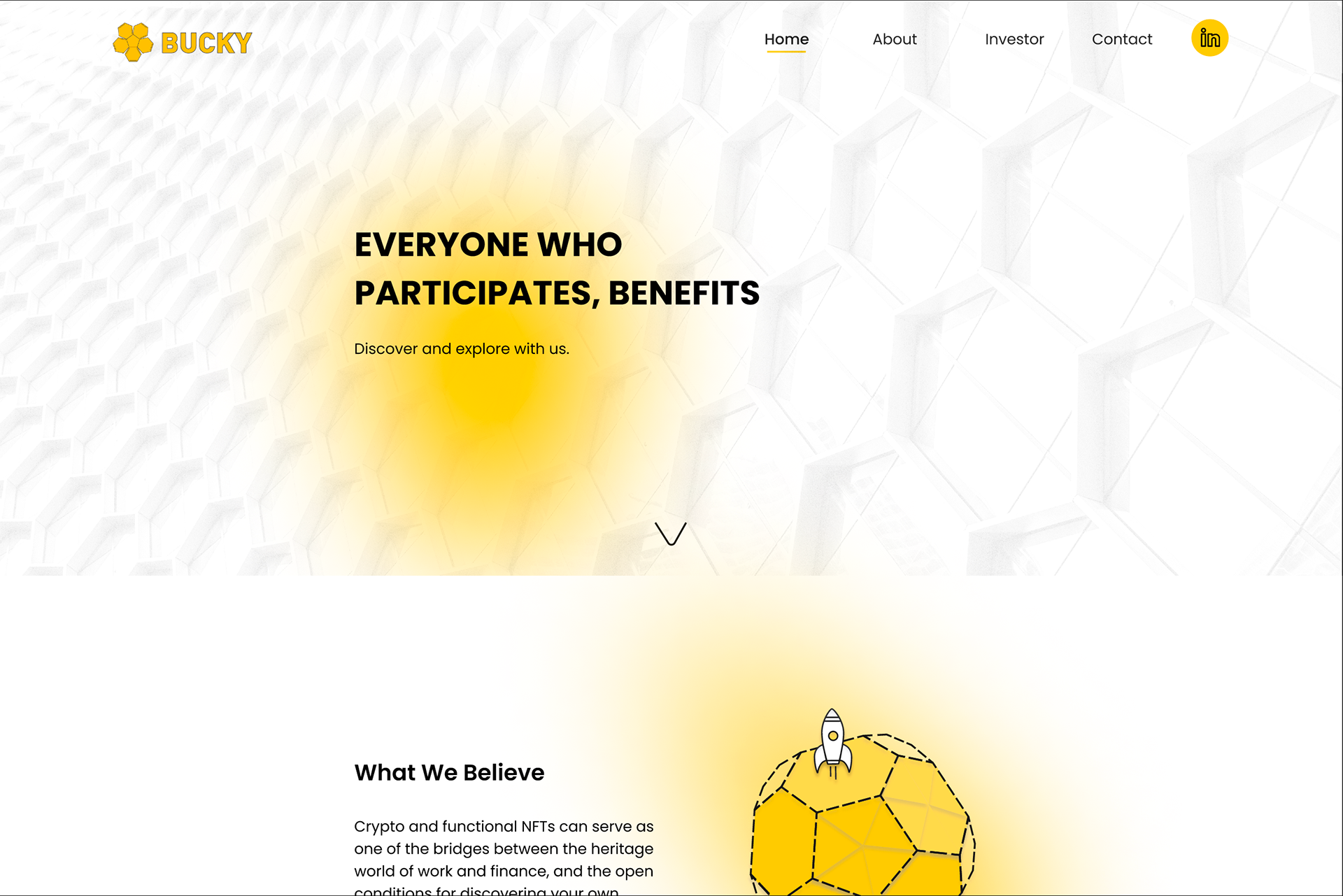
Desktop Version - Home Page - Landing Page
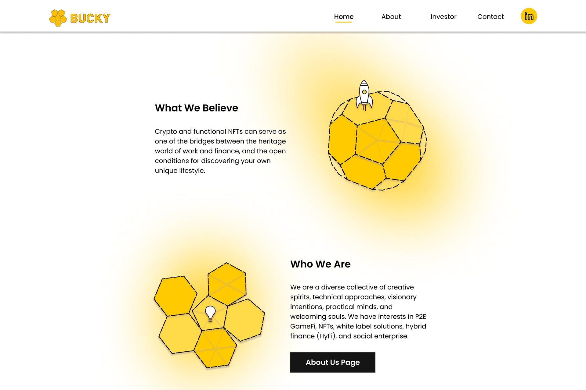
Desktop Version - Home Page (cont.)
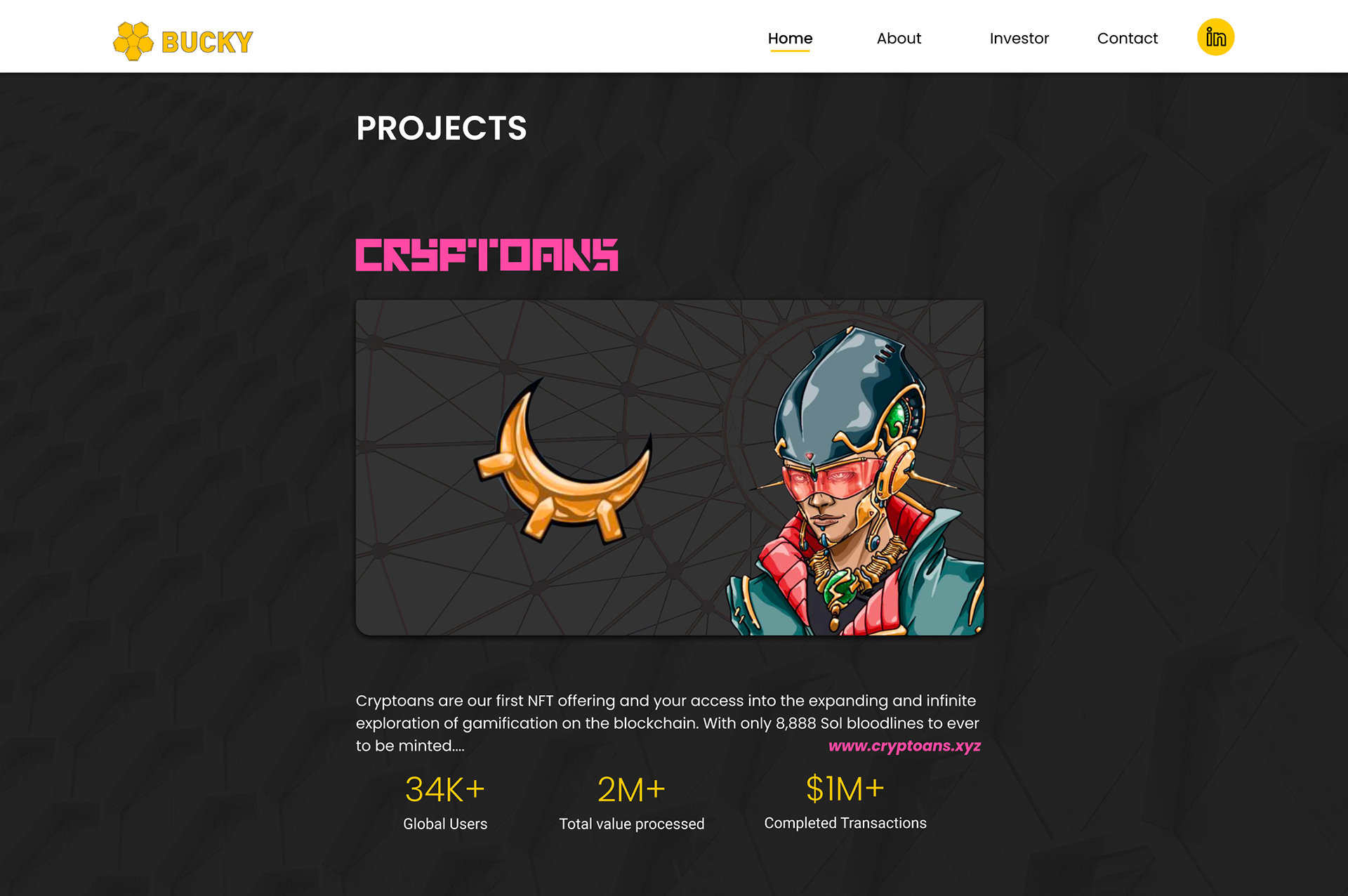
Desktop Version - Home Page (Projects)
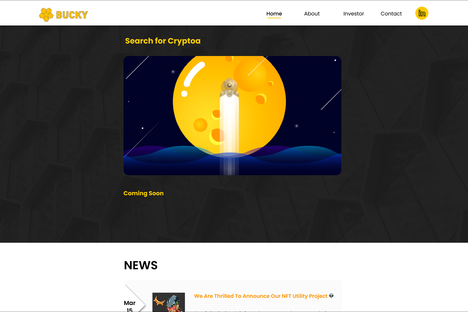
Desktop Version - Home Page (Projects cont.)
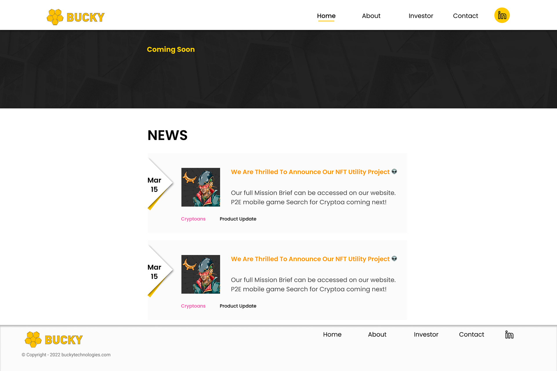
Desktop Version - Home Page (News)
About page Mockup
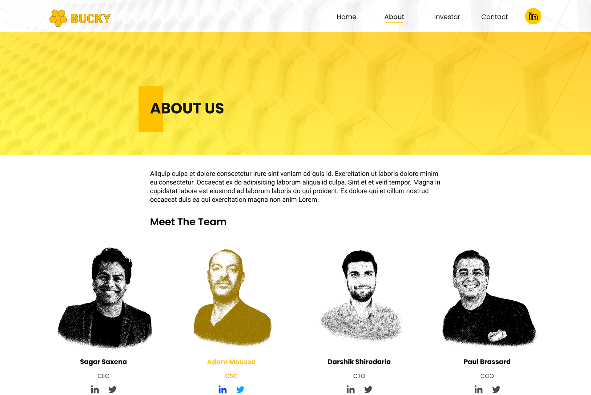
About Us Page
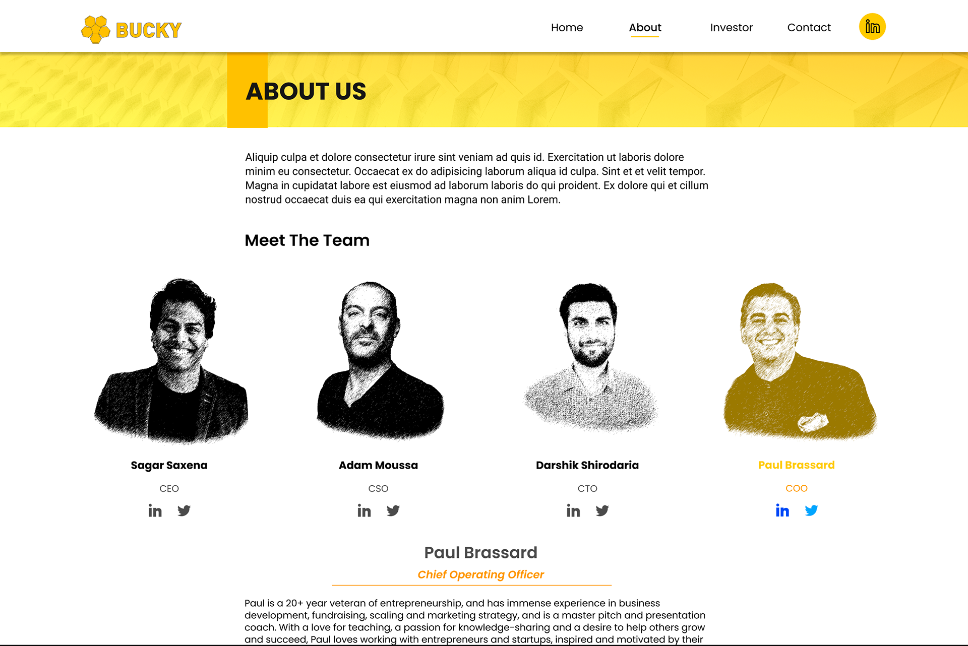
About Us Page - Selected
Investor Page mockup
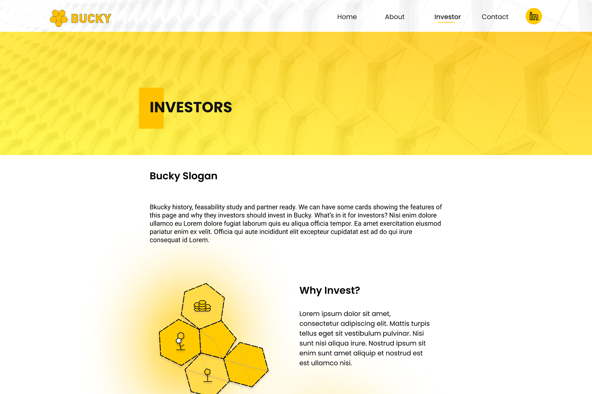
Desktop Version - Investor Page
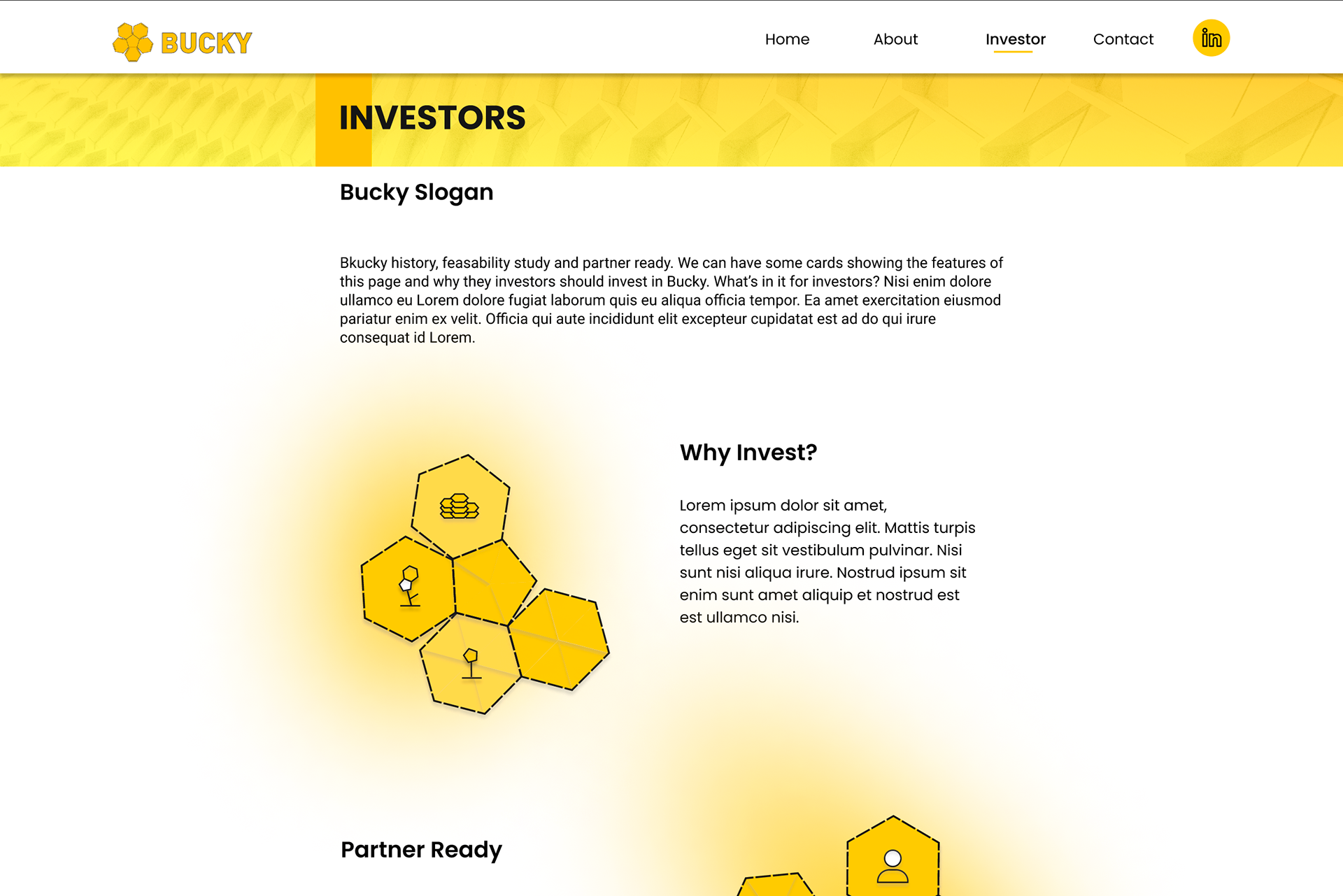
Desktop Version - Investor Page (cont.)
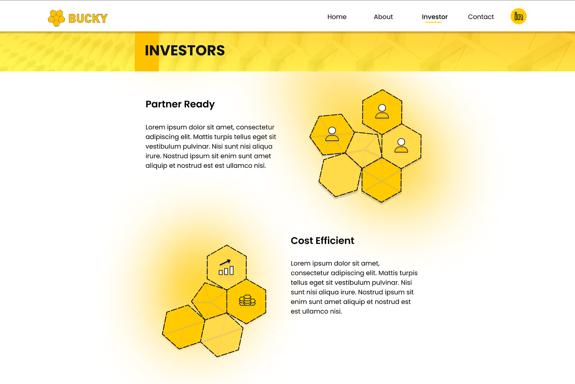
Desktop Version - Investor Page (cont.)
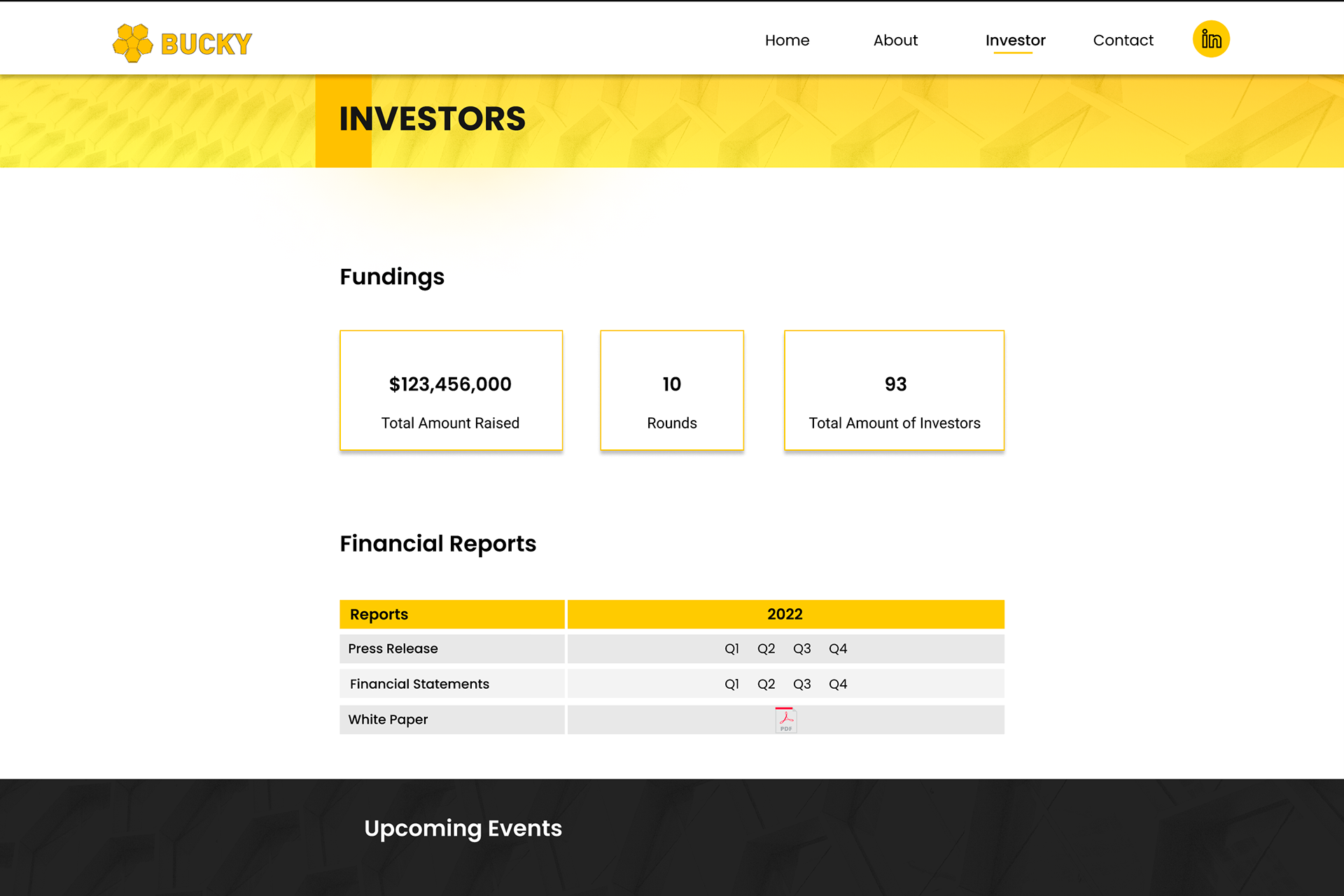
Desktop Version - Investor Page (cont.)
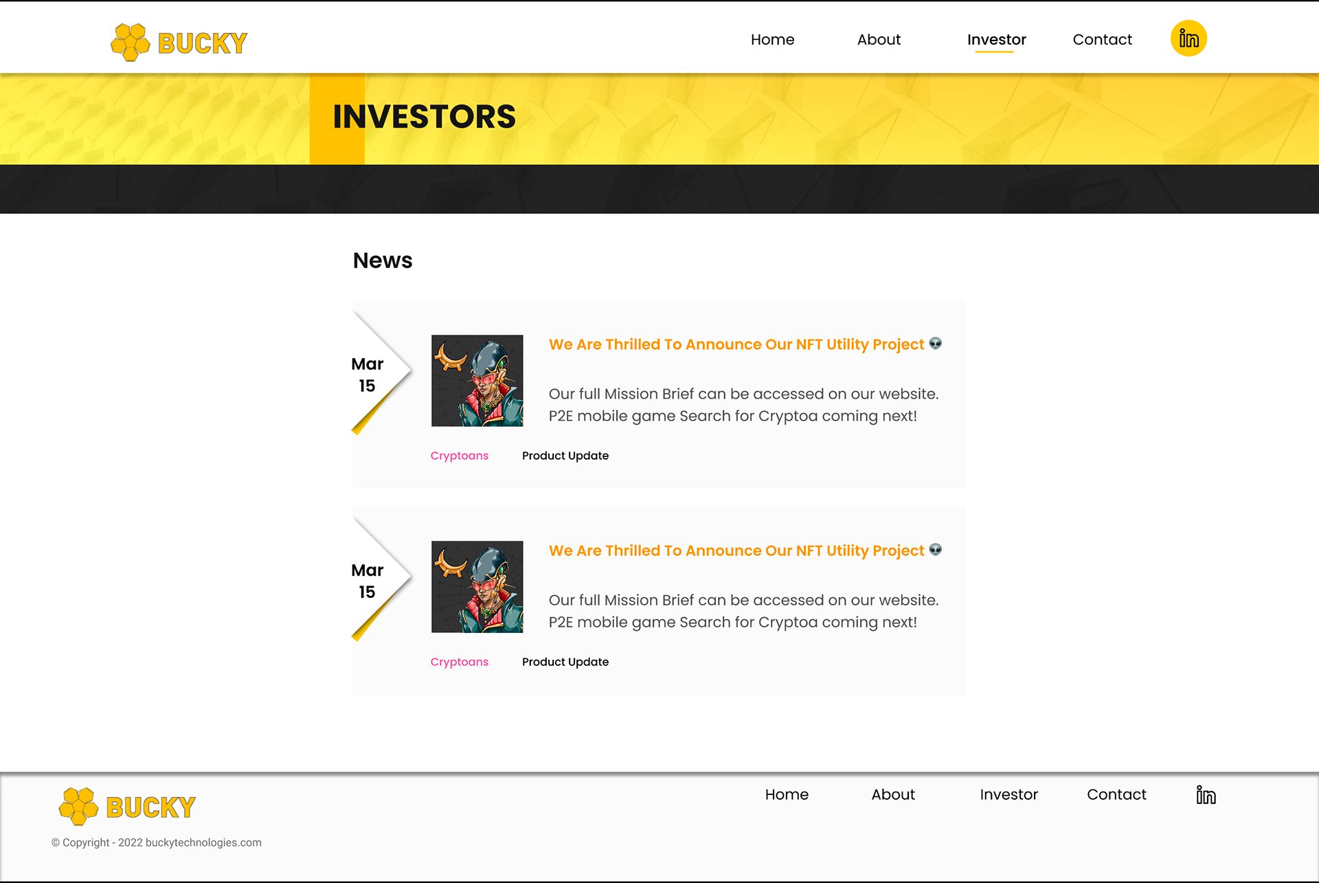
Desktop Version - Investor Page (cont.)
Mobile Version
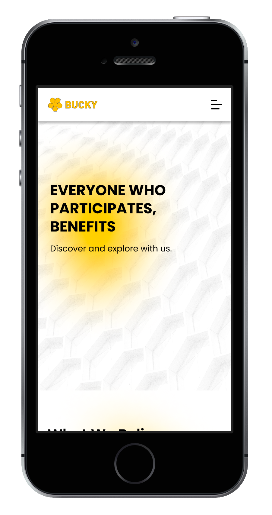
Mobile View - Home Page
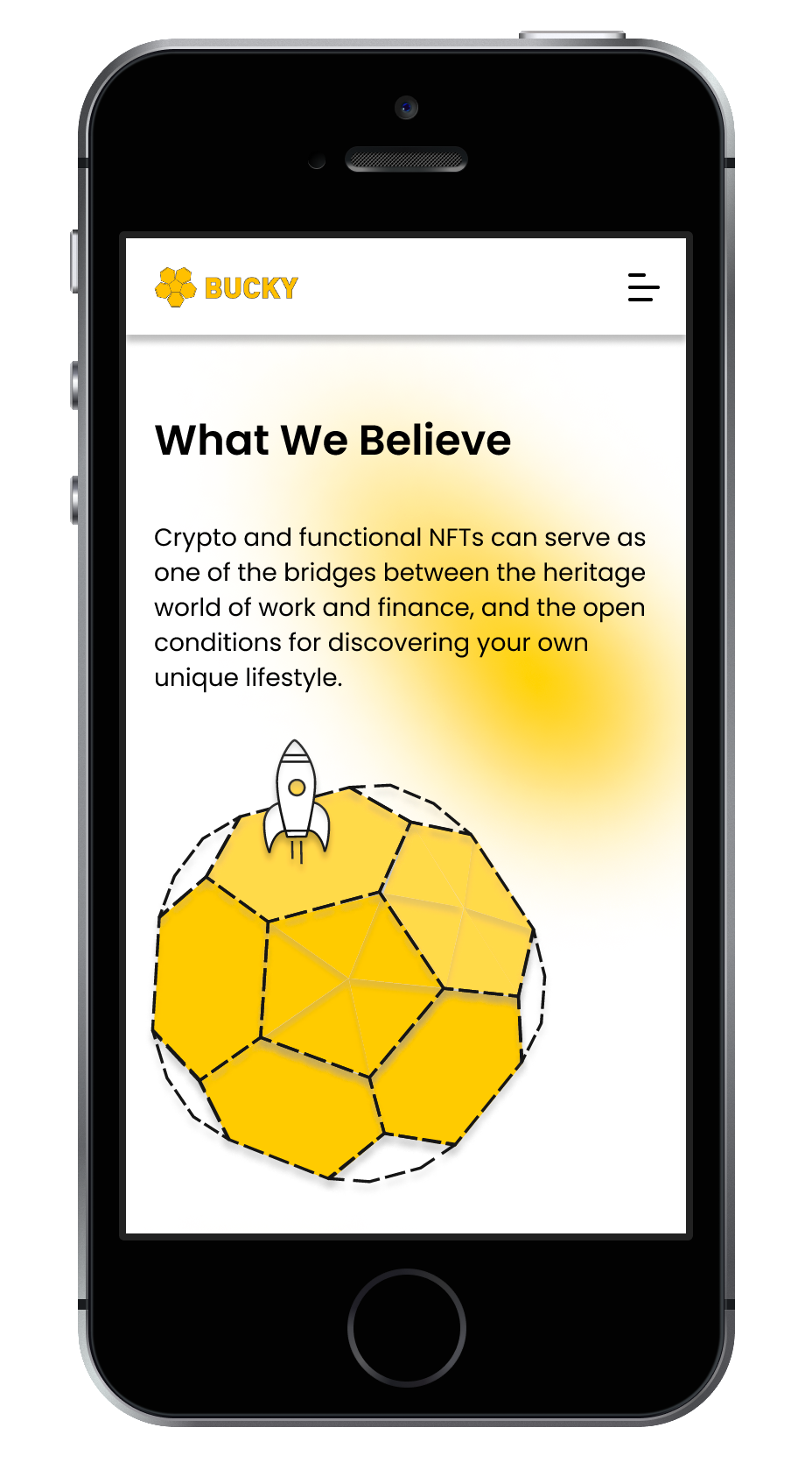
Mobile View - Home Page (cont.)
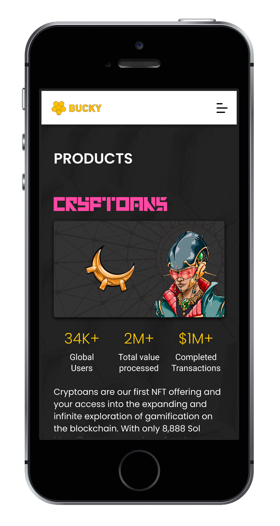
Mobile View - Home Page (cont.)
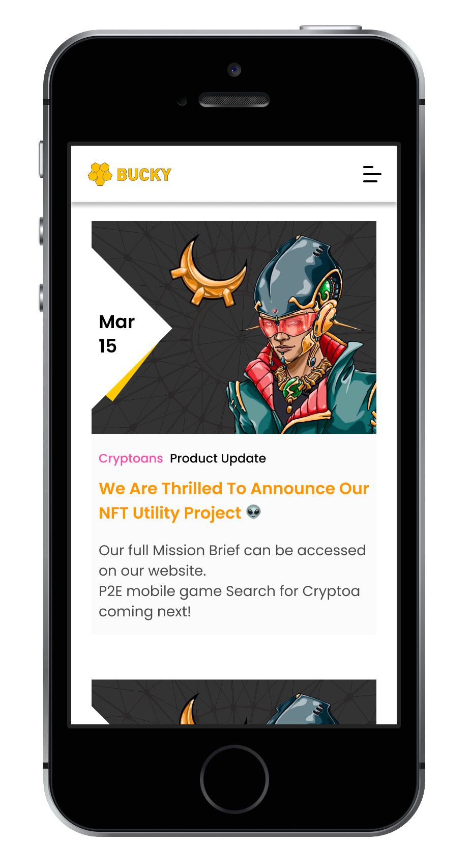
Mobile View - Home Page (cont.)
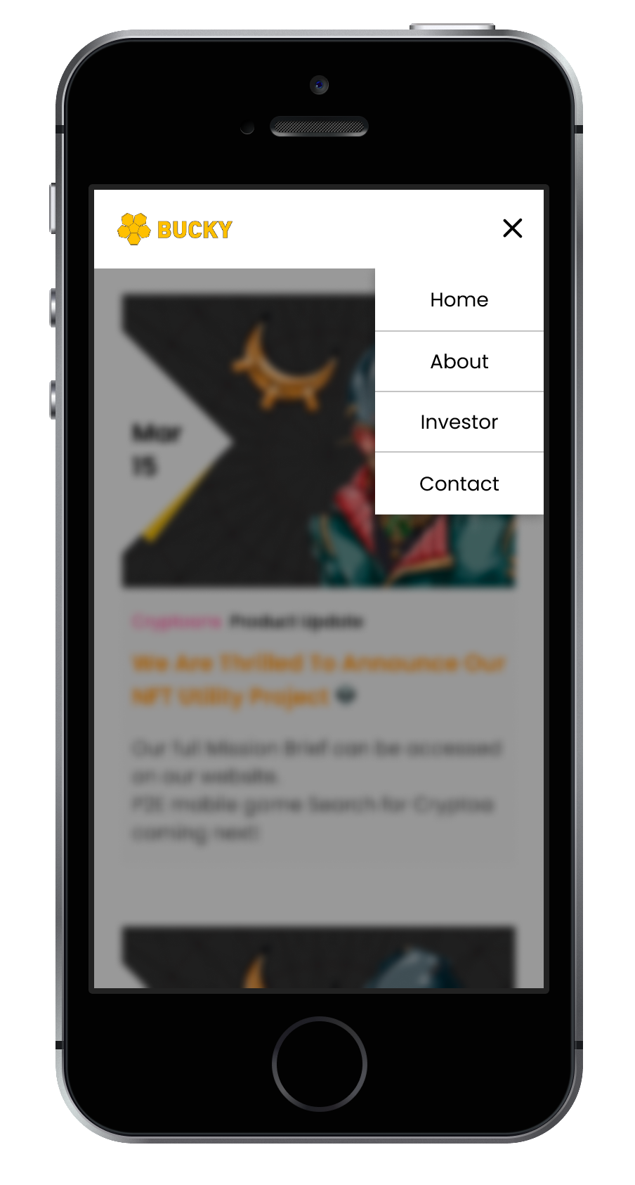
Mobile View - Menu
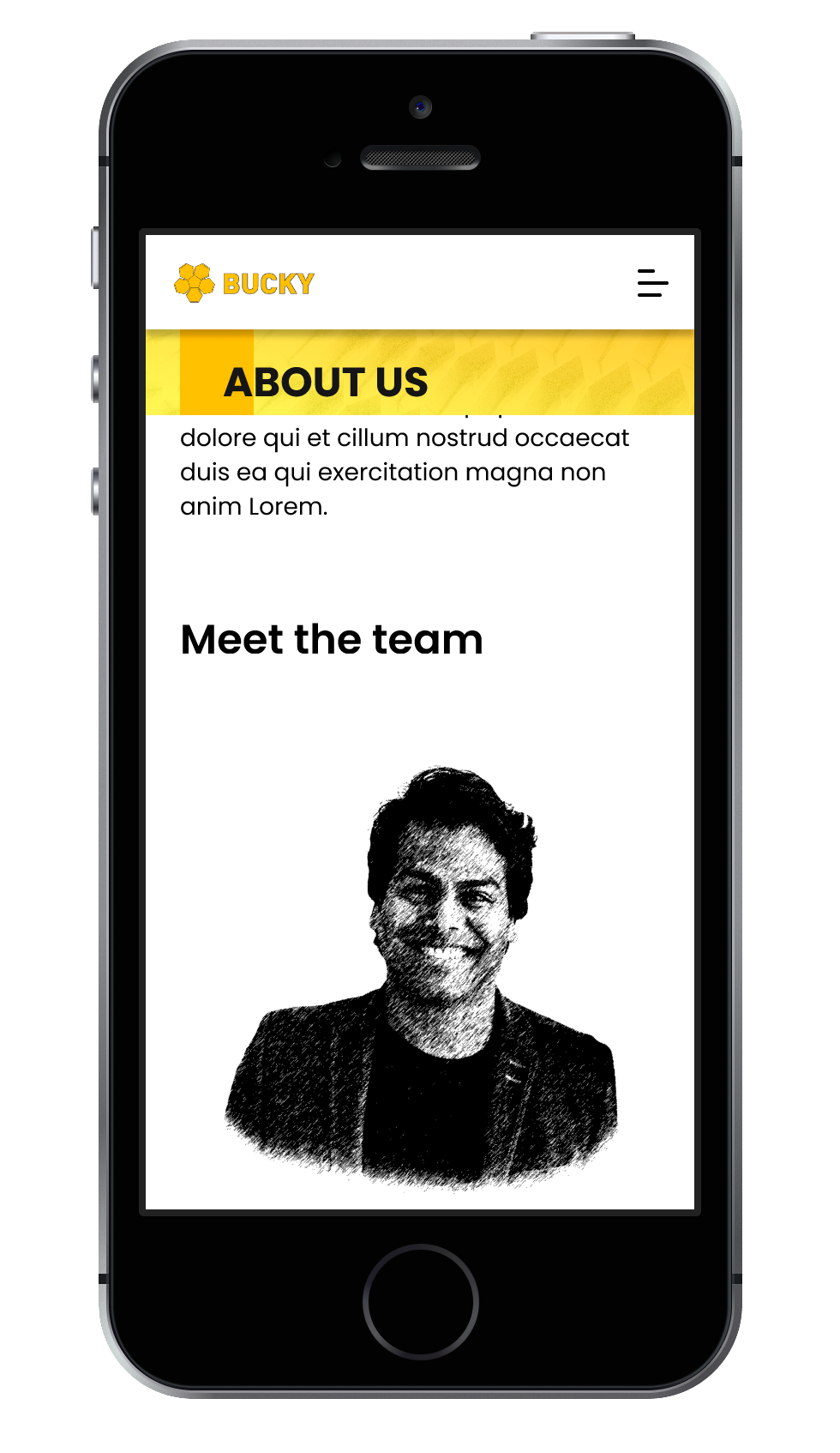
Mobile View - About Us Page
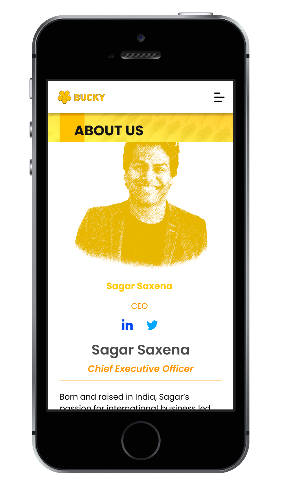
Mobile View - About Us Page (Selected)
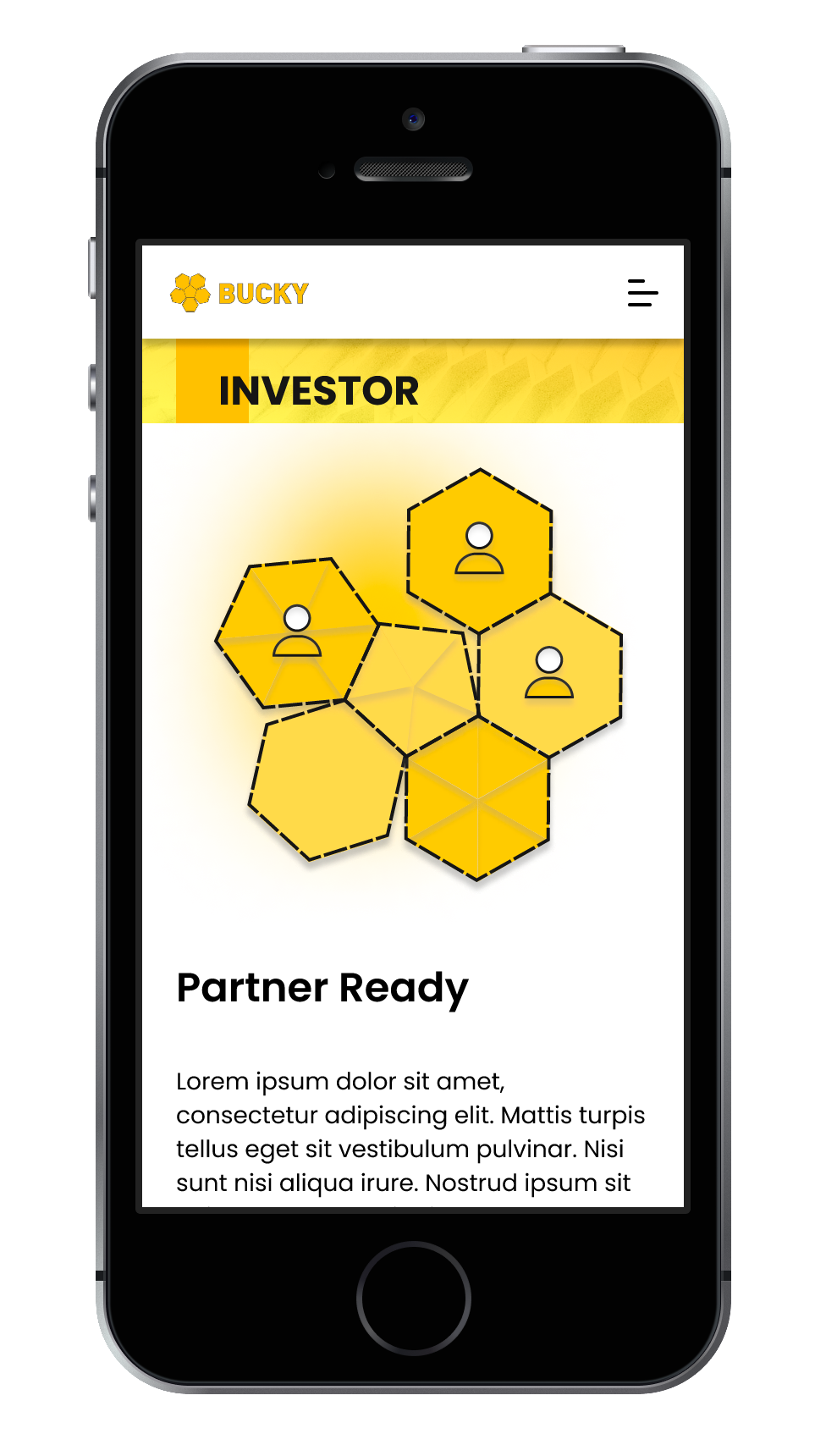
Mobile View - Investor Page
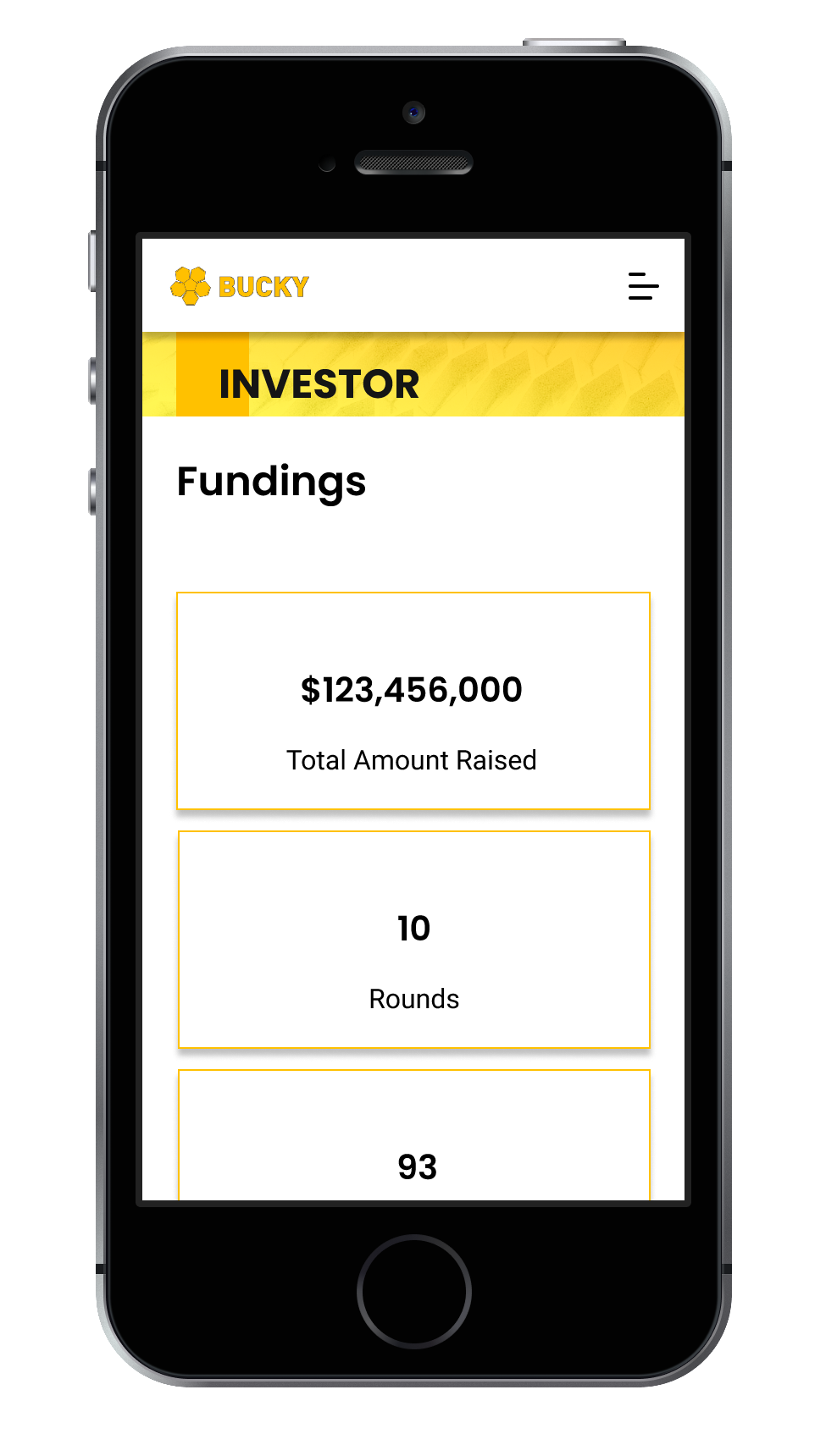
Mobile View - Investor Page (cont.)
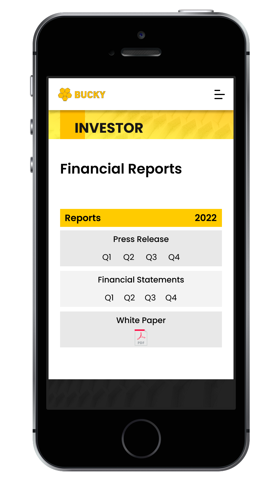
Mobile View - Investor Page (cont.)
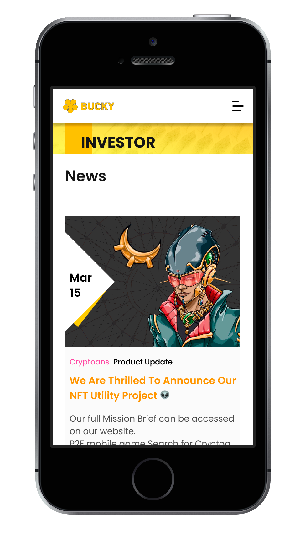
Mobile View - Investor Page (cont.)
